Batches Bakehouse Ordering System
Designing mobile and desktop website experience for a new San Francisco bakery.
PROJECT TYPE
Client Project
MY ROLE
User Research
Wireframing
Brand Design
Prototyping
Usability Testing
TOOLS
Figma
DURATION
4 Months (2022 – 2023)
Overview
Lines wrap around the block for popular San Francisco bakeries. How can we compete?
This is a big question for Ashley, an entrepreneur who plans to open a bakery in Inner Richmond's culinary haven – Clement Street. Ashley and her husband, Jimmy, founded the Blue Danube coffee shop on Clement twenty years ago, and their plans to start baking their food in-house blossomed into an idea for a brand new bakery called Batches.
Ashley and Jimmy asked me to create prototypes for a website and ordering system for Batches, which they plan to open in 2024. Batches will be all about high-quality baked goods at reasonable prices, made with responsibly grown fruits and vegetables that are organic and in-season. They will have everything from bagels to freshly baked grab-and-go meals to custom cakes. Batches will not be a sit-down restaurant, but a to-go window where people can order and pick up quick, portable bites.
The Problem
College students and parents in the neighborhood are short on time, and they can't wait in long lines for fresh, high quality food. The Batches Bakehouse website needs to demonstrate the quality of its food AND provide a convenient way to skip the line.
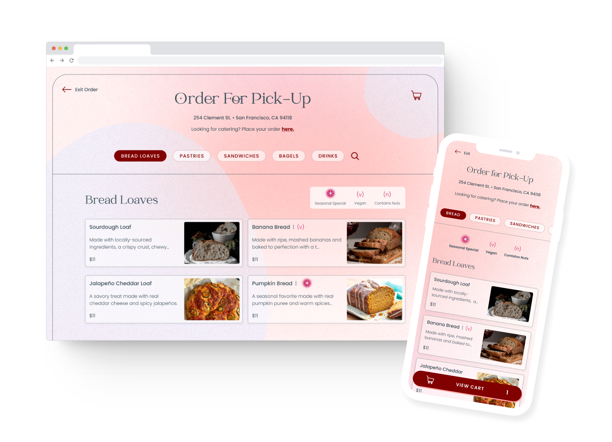
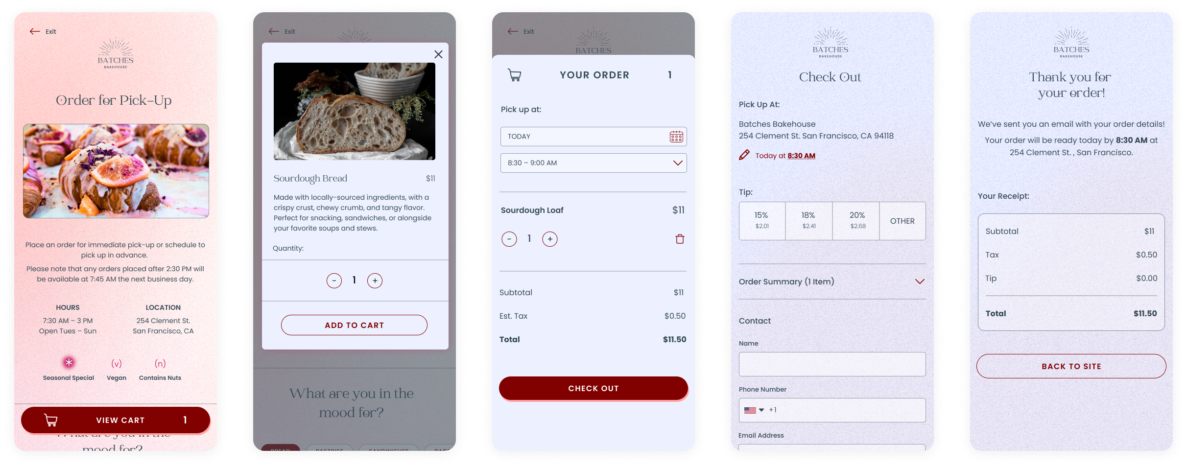
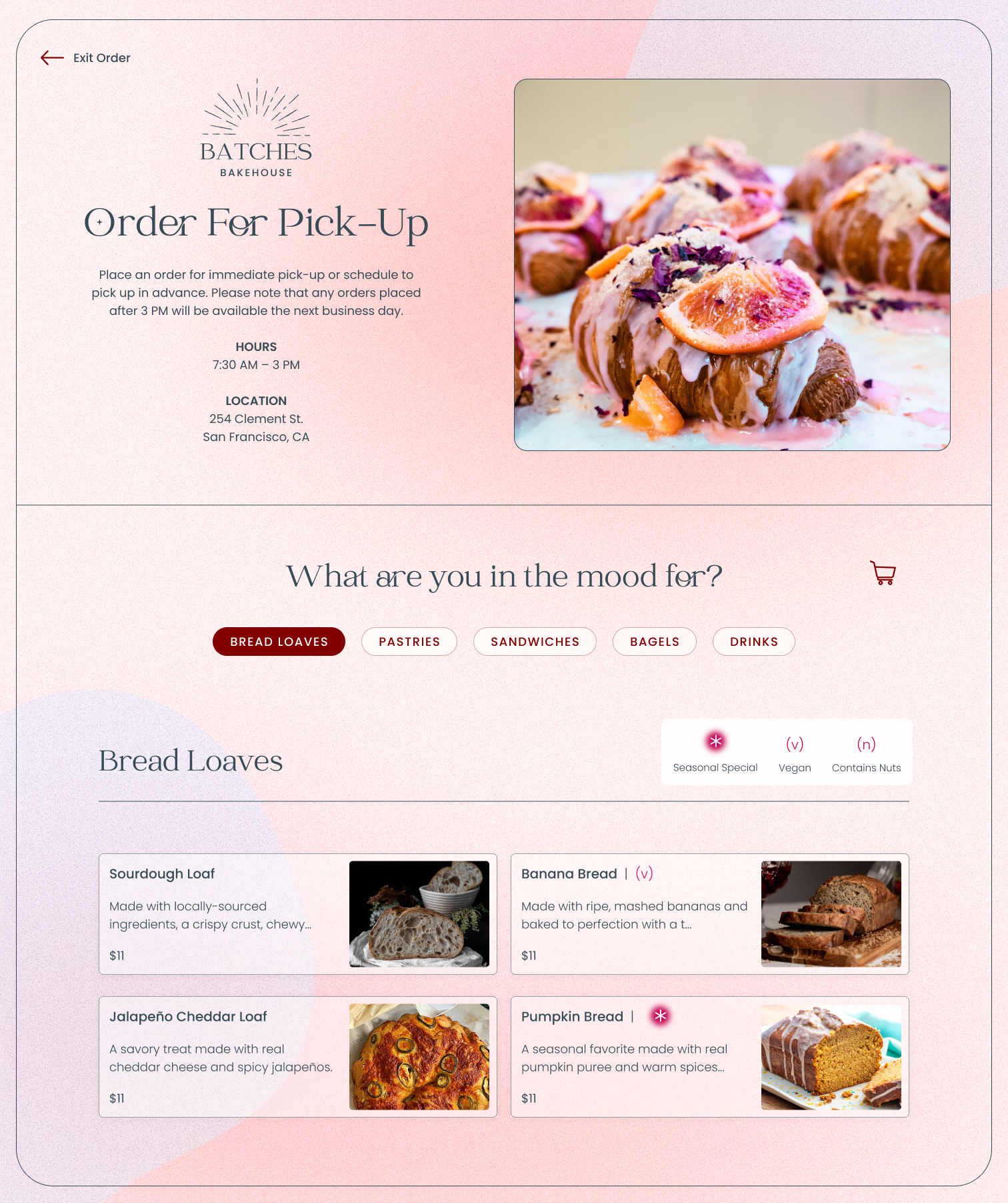
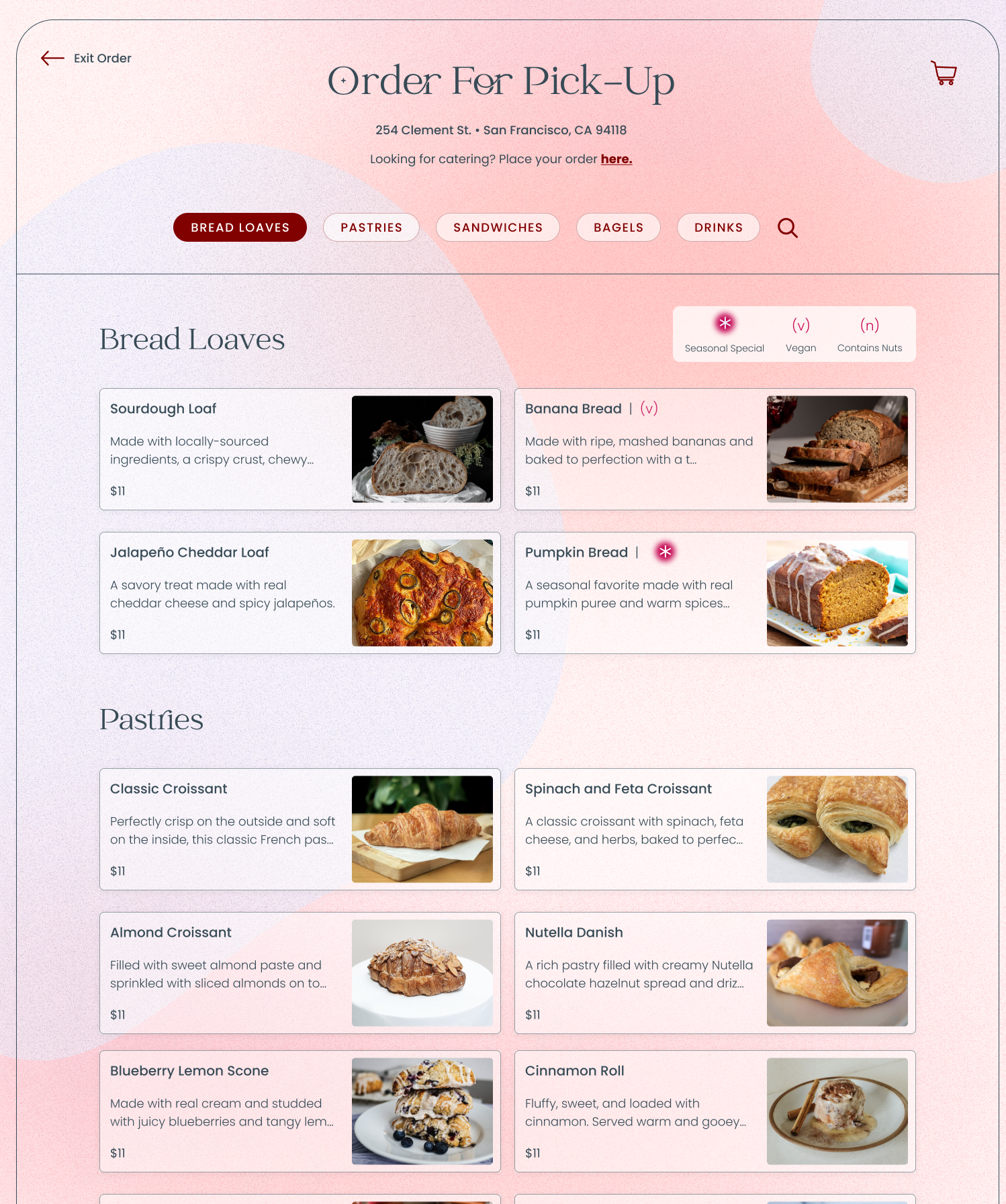
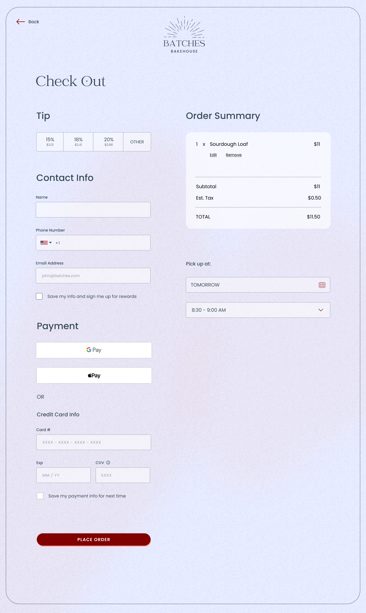
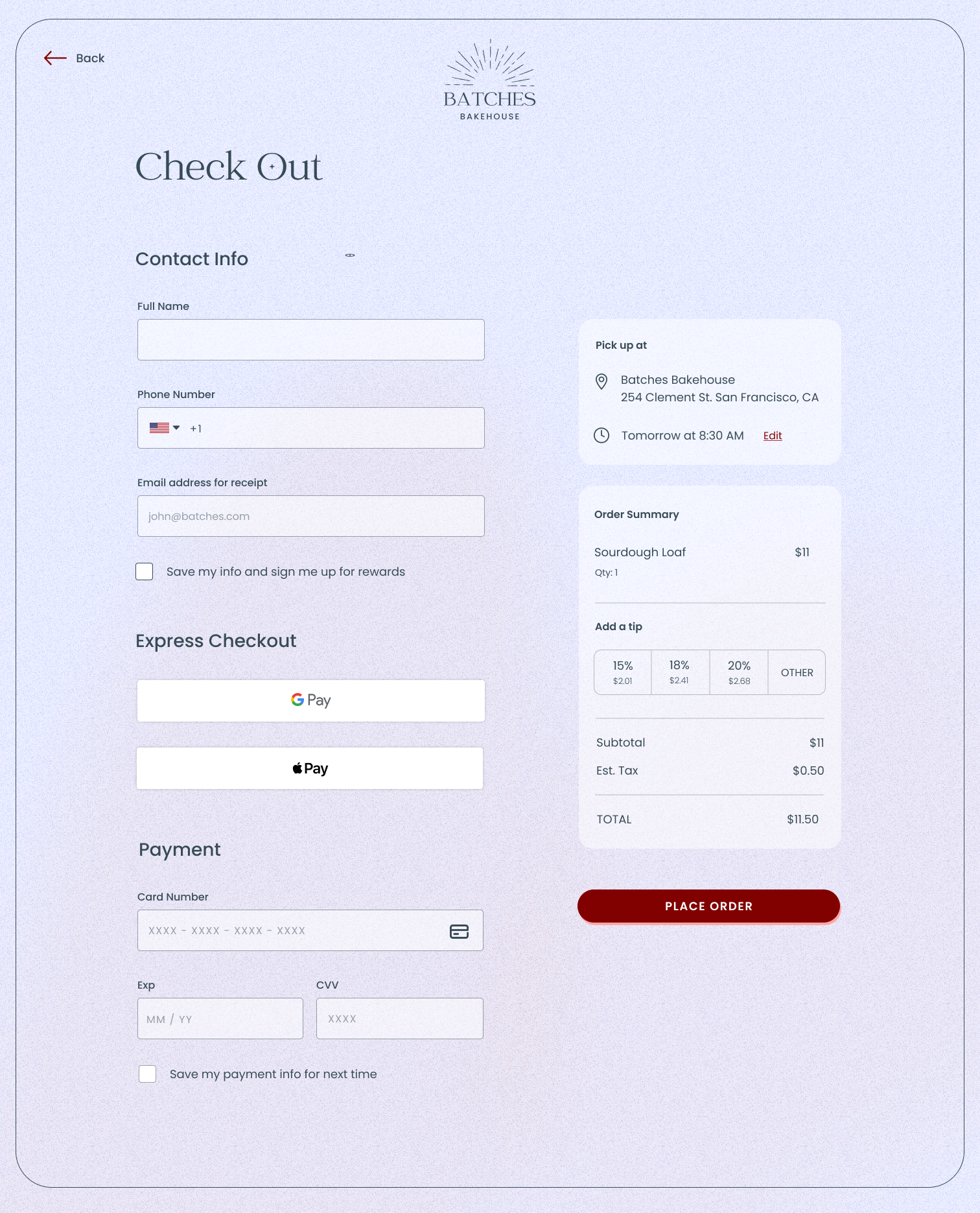
The Final Ordering Flow
Jimmy and Ashley aren't quite ready to develop this yet, but when the time comes, I will continue to work with them on any updates as needs arise.
On Desktop
On Mobile
Competitive Analysis
I started by analyzing what local eateries are doing well (or not).
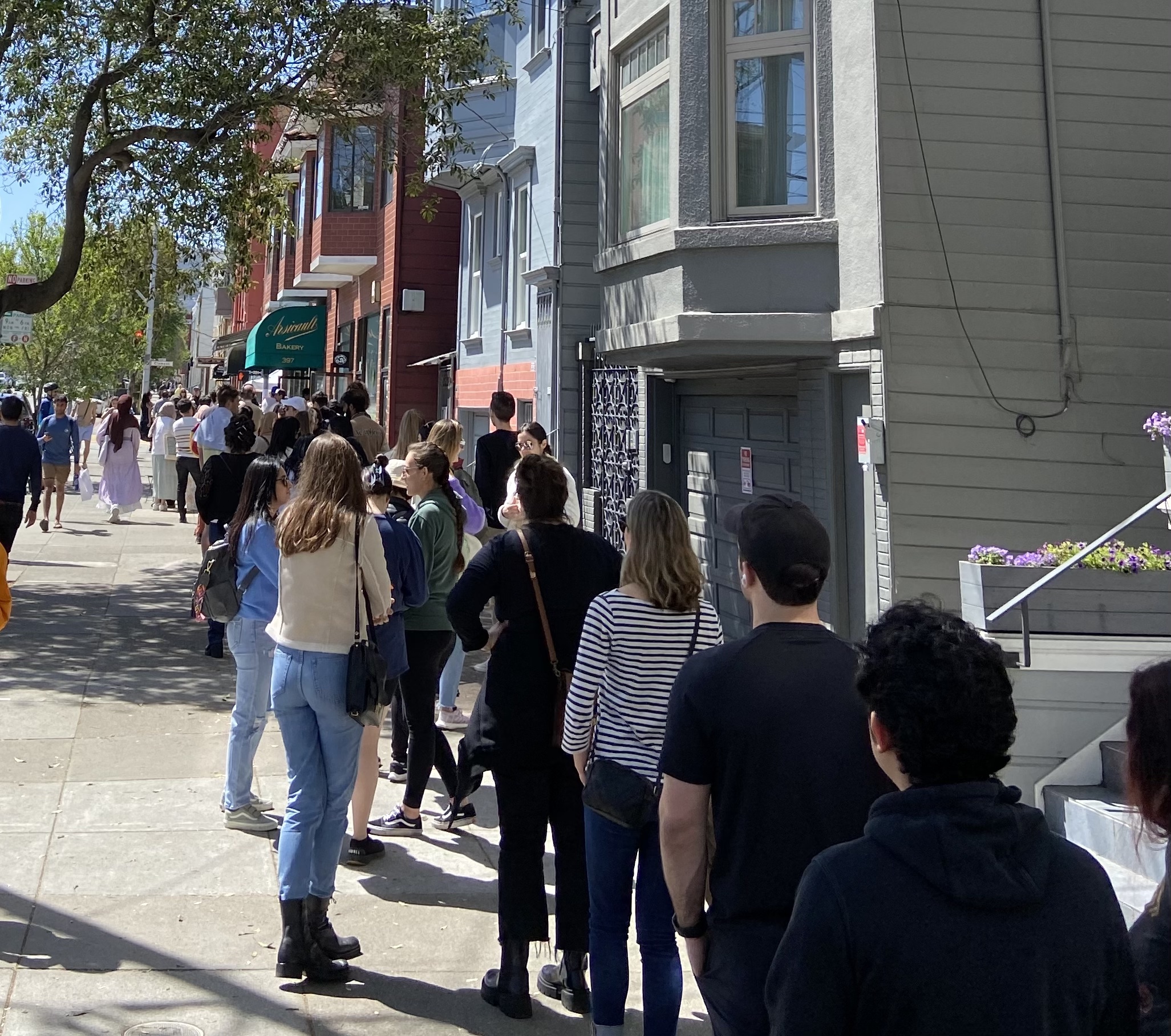
I chose to start with what would be the bakery's biggest competitor – Arsicault, an extremely popular spot known for the best croissants in the country! Visitors are willing to stand in line for a half hour to stock up on pastries, but locals like me are not. As I took this picture of Arsicault's line on a Saturday morning, one of my neighbors stopped on his bike and said to me, "No pastry is worth a line that long!"
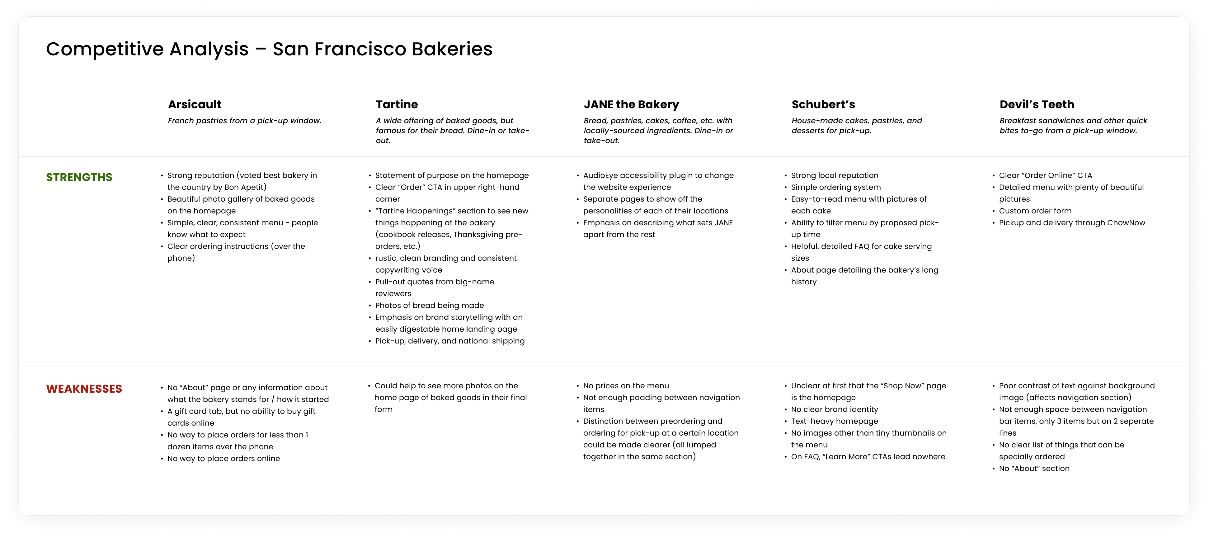
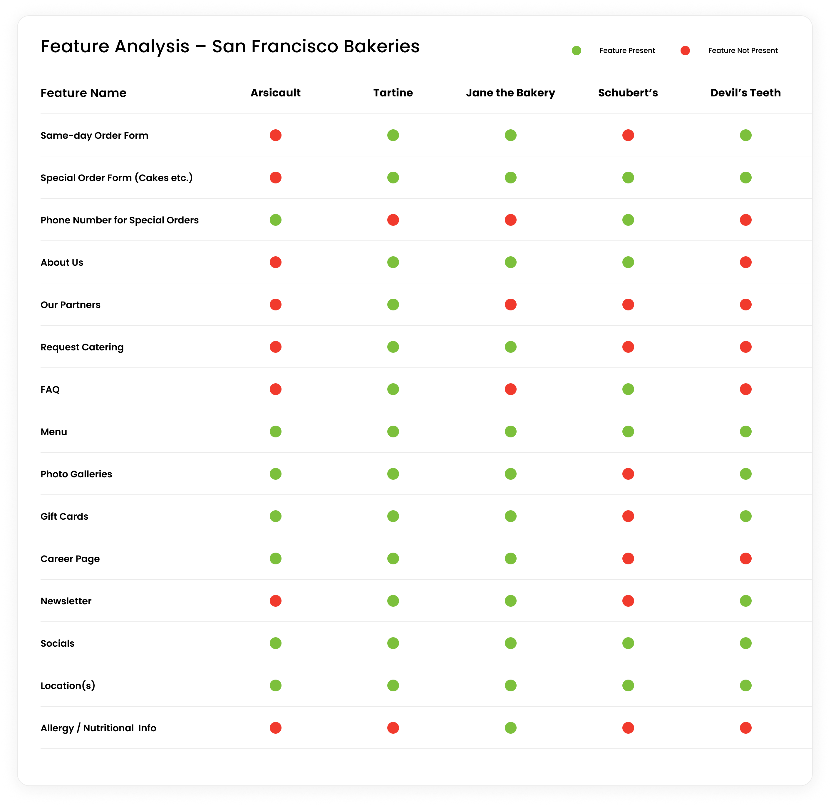
I created a chart of strengths and weaknesses among popular SF bakery websites. I found that there was a lot of missing information about custom orders, and many of the websites did not have a statement of purpose. A commonality between these sites is a gorgeous photo gallery of some kind, highlighting the food.
User Interviews
Next, I interviewed five target users remotely to get a sense for how they use bakery websites.
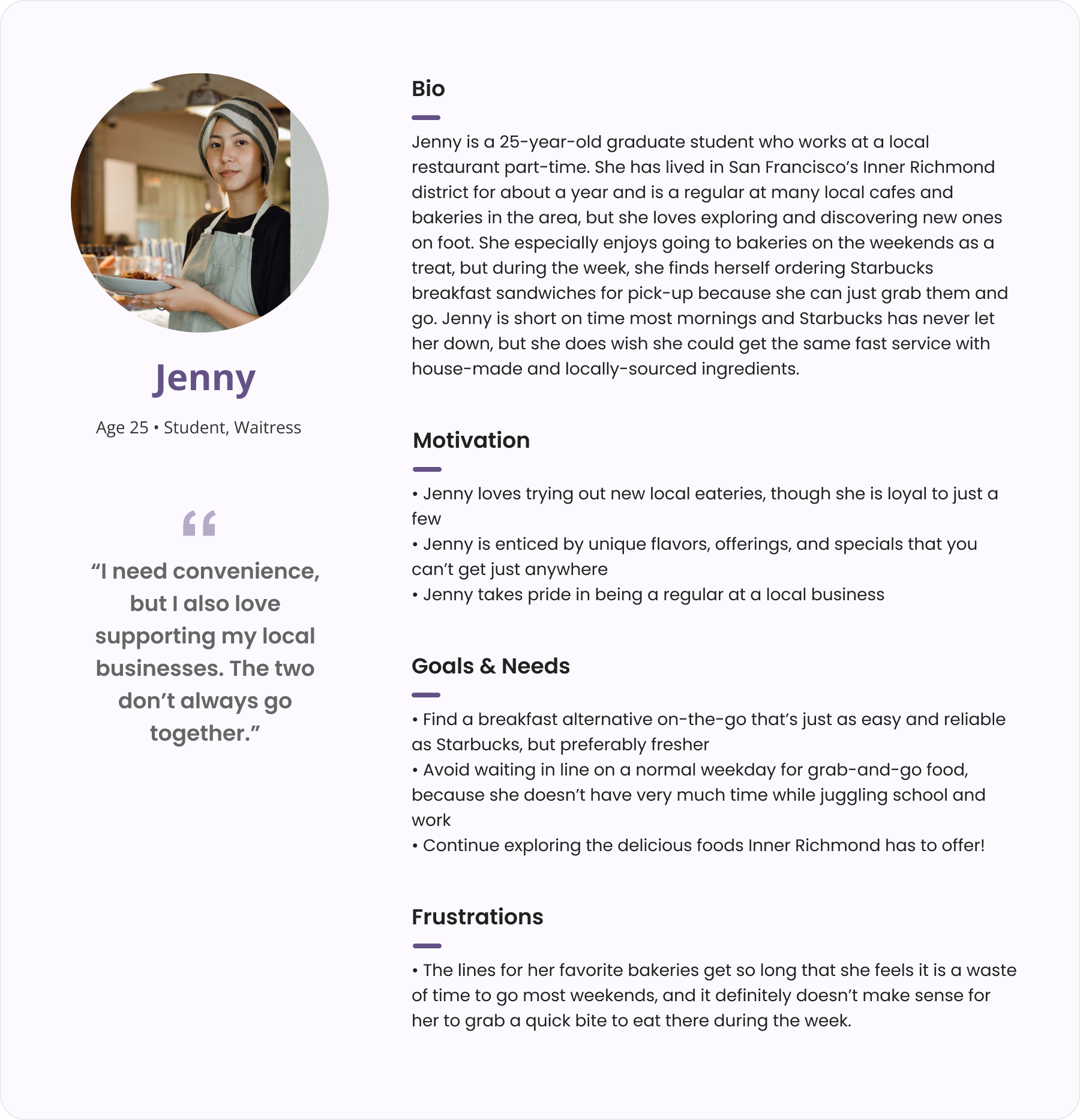
These users fell into one of two categories: parents/caregivers of children or college students. According to Ashley, Batches Bakehouse will cater to these two groups the most.
Objectives for 1:1 Interviews
- Understand how locals go about finding a quick bite to eat when they are on the go
- Find out how people prefer to order food, depending on the situation
- Understand what makes an ordering experience pleasant or frustrating
- Find out what makes people want to try a new eatery, and what deters them
- Learn what people typically go to bakery websites to do
Findings & Analysis
Busy locals aren't willing to wait very long in line on a weekday if they know what they want.
Though I spoke to two demographics of people, their needs and pain points were similar enough to combine into a single persona. I created this as a synopsis of my research to present to the clients.
Design
With design priorities in mind, I began planning the information architecture and user flows.
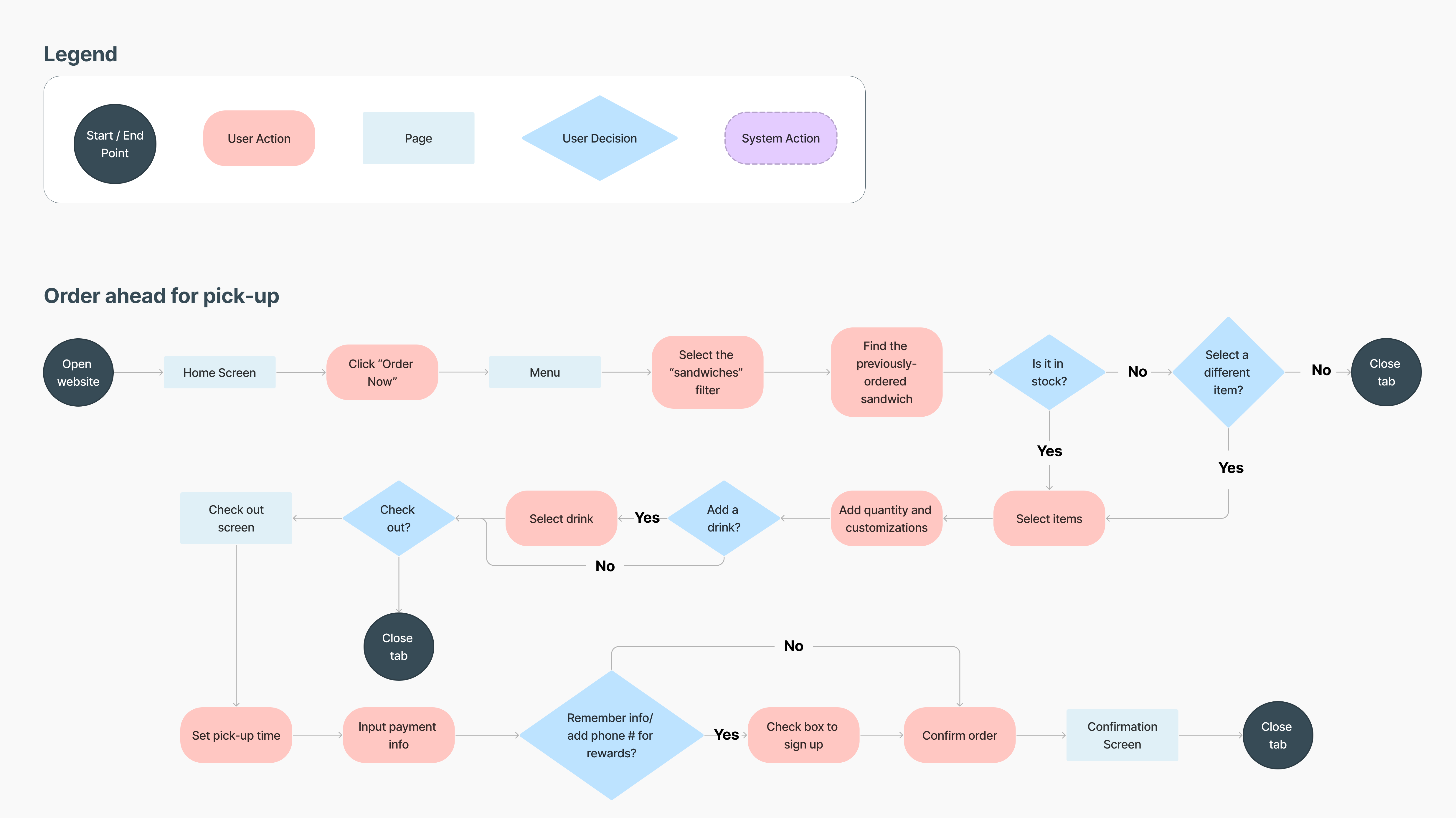
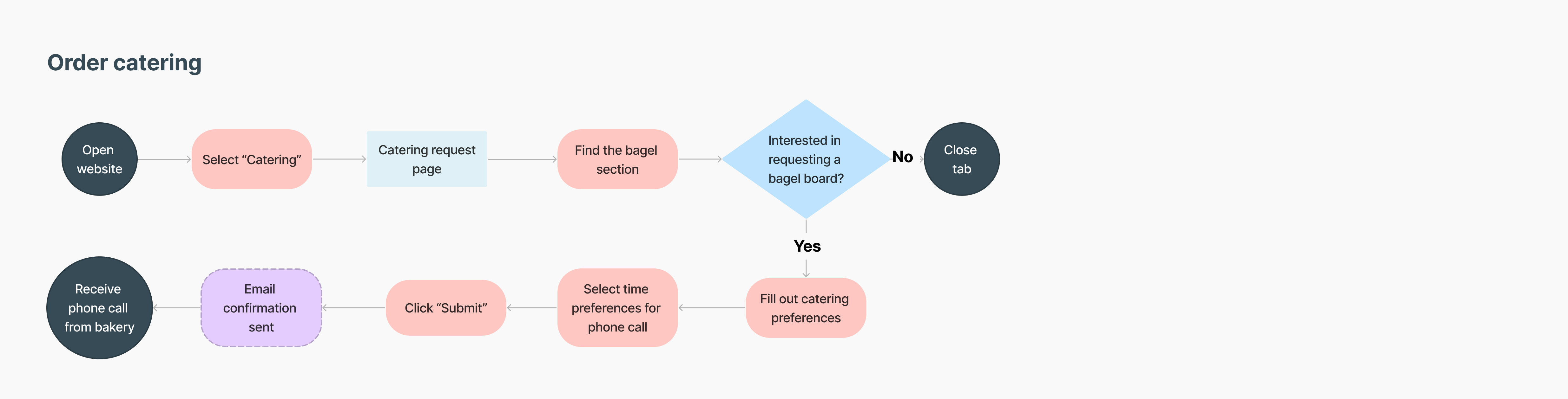
I presented this research to the client, and it confirmed their reasoning for wanting to start a bakery centered on convenience and quality. We decided on three main features to prioritize: order cakes, order catering, and order for pick-up ahead of time.
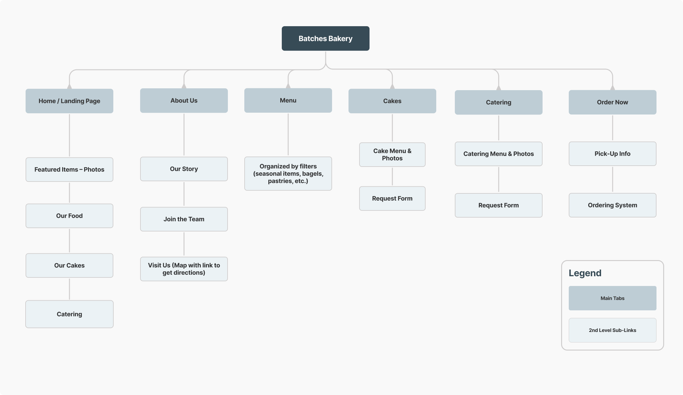
Sitemap
I planned out the content structure based on the client's priorities.
User Flows
Based on the three main tasks we wanted the user to accomplish on the website, I created three user flows to identify potential drop-off points and user choices to design for.

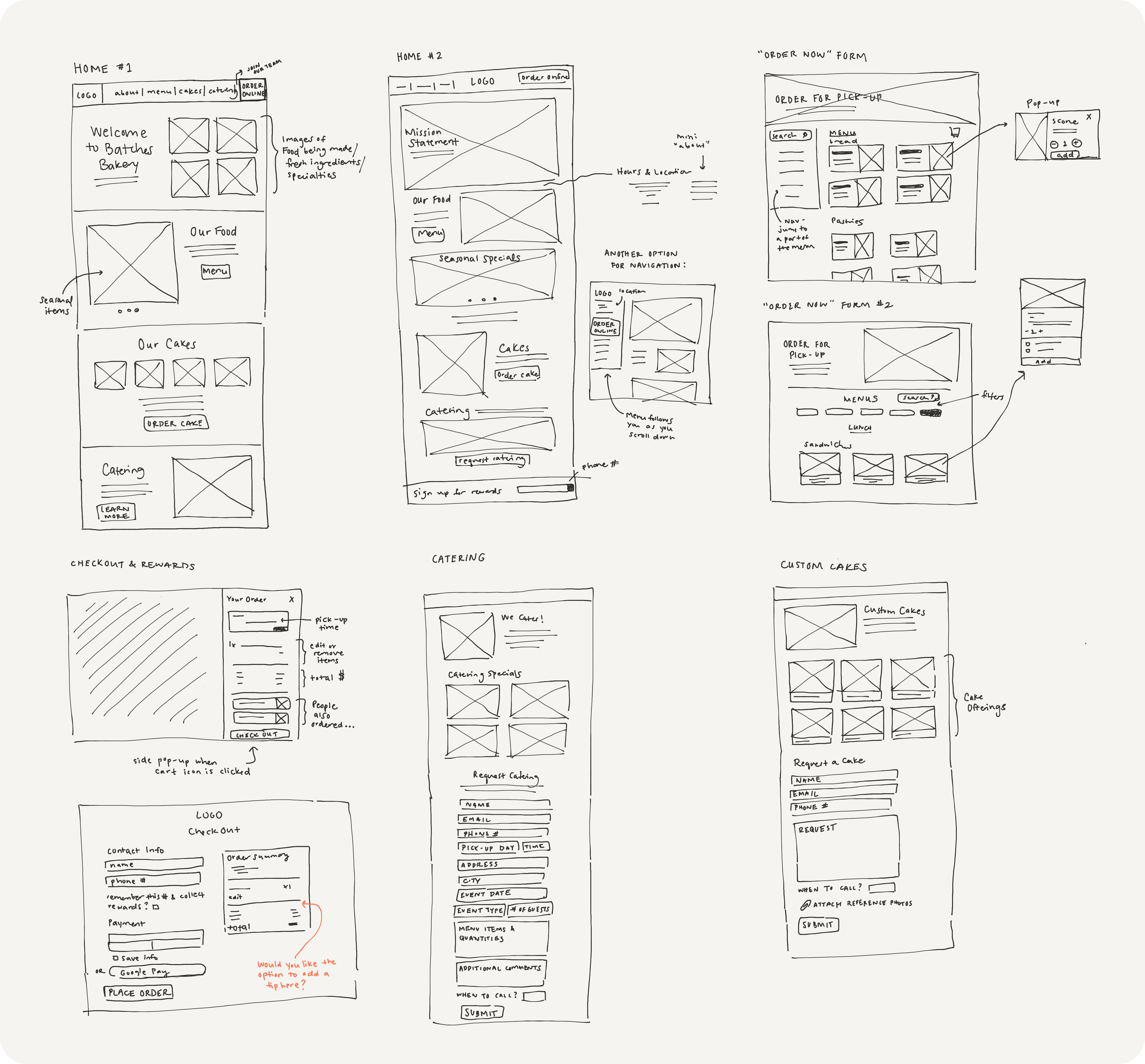
Low-Fidelity Explorations
I created some low-fidelity wireframes to figure out page layouts.
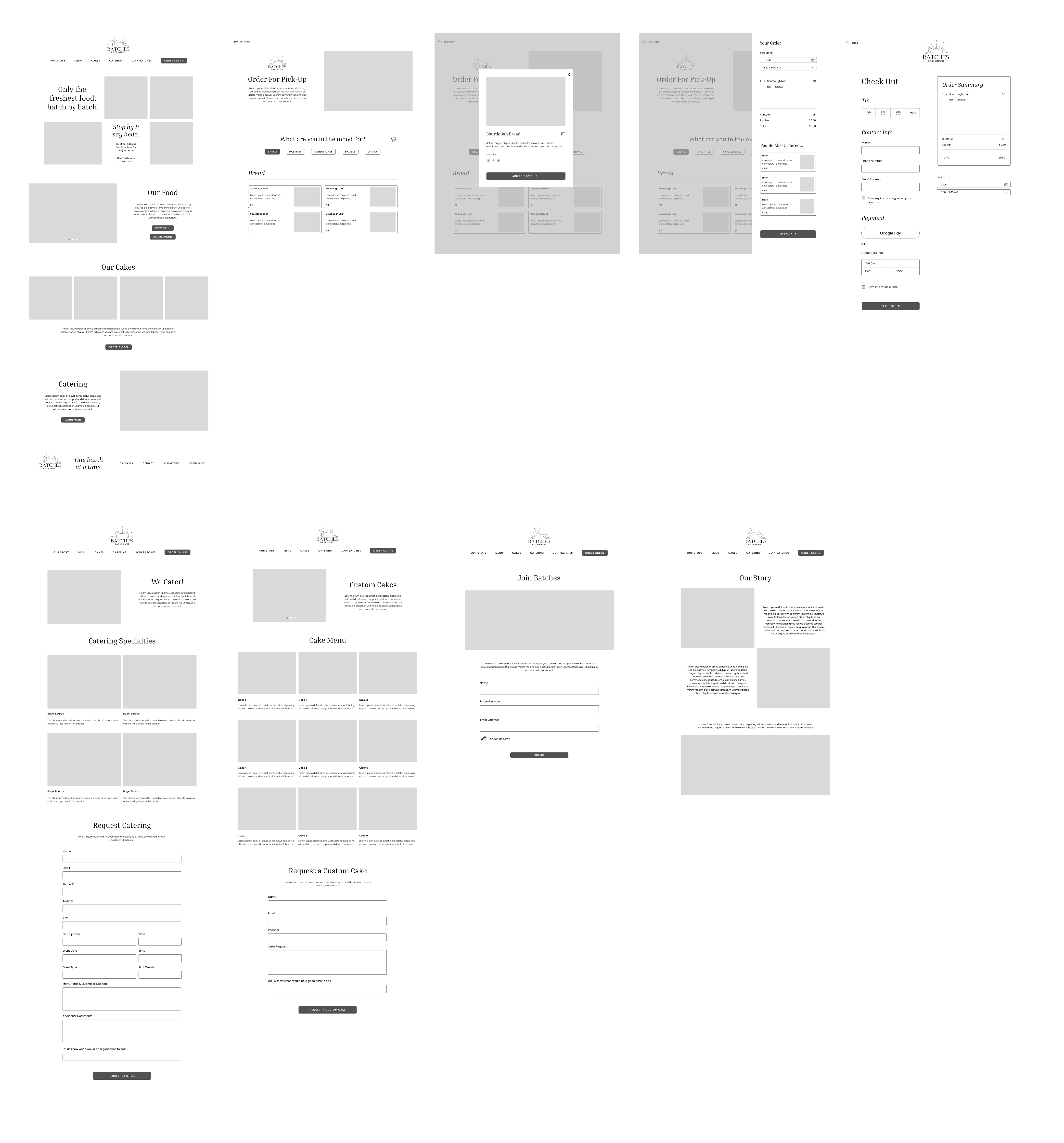
Mid-fidelity Wireframes
I brought my favorite layouts and ideas to a higher fidelity to show the client. After a few rounds of changes, these were the final mid-fidelity screens.
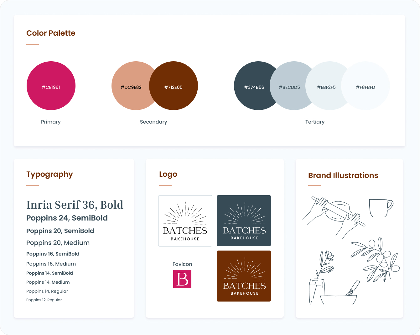
Branding
Given the logo, font, and primary color by the client, I created a mini style guide.
The client provided me with a few brand elements, and as I began designing with the bright magenta, I realized it was quite harsh on the eyes to be the only rich color in the palette. I rounded out the palette with a deep chocolate brown, caramel brown, and a few blue shades to create a sense of serenity against the loud pink.
Provided the existing logo, I needed to make the brand personality bohemian, warm, and bright. The fonts in the logo are Catchy Mager and Poppins, so I used those fonts throughout the website. I also hand-drew some illustrations to add personality and warmth.
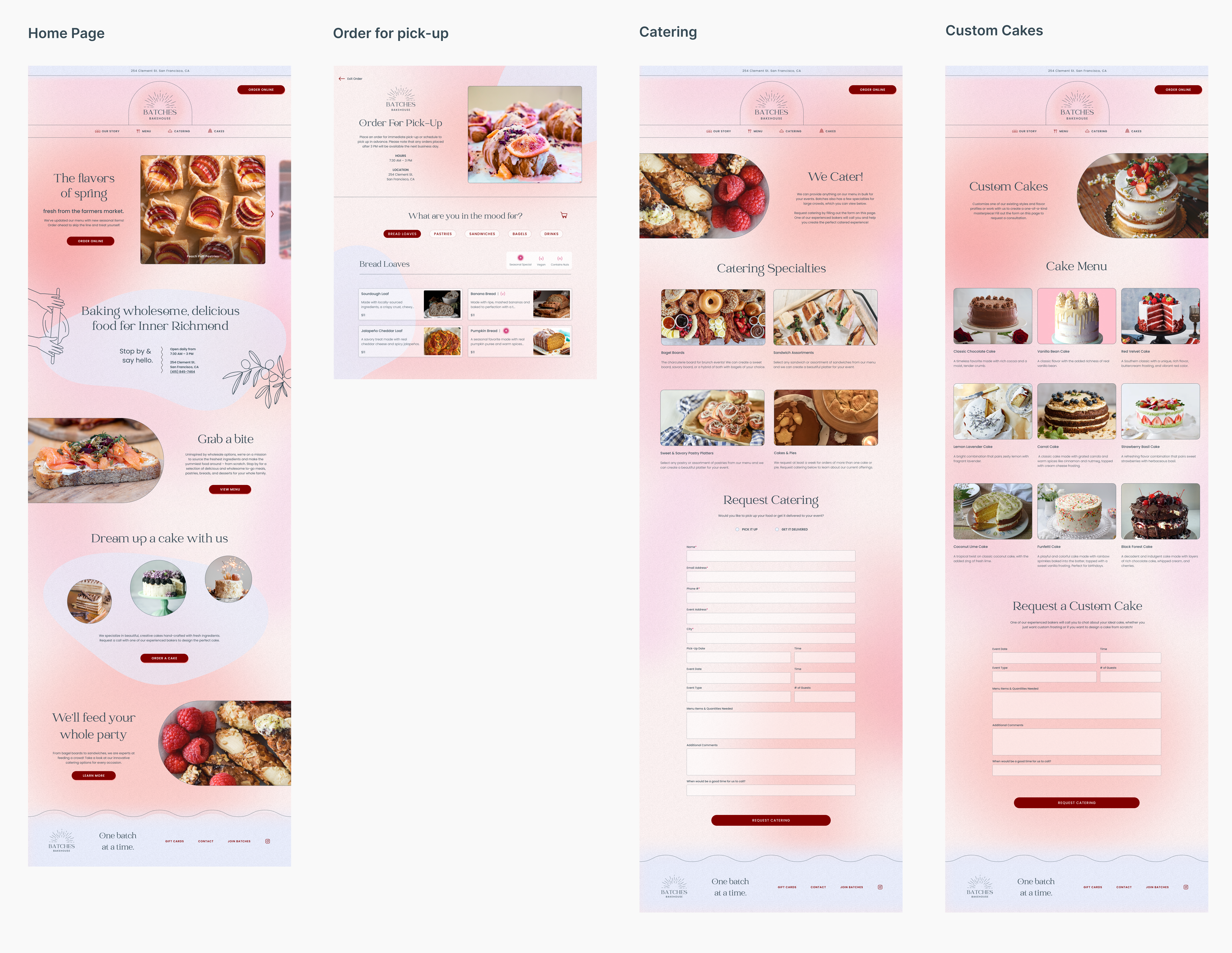
High Fidelity Prototype
I applied the branding and made some layout tweaks before arriving at this iteration.
These are select screens from my first round of designs.
Mobile Adaptation
To ensure that the site is responsive, I made sure to optimize the ordering flow for mobile as well.
Usability Tests
Over Zoom, I tested five users' ability to complete the three task flows.
I paid close attention to where users hesitated or expressed confusion about where to click to progress in the flow. Users completed the following 3 tasks:
- Place an order on both desktop and mobile
- Request catering
- Request a cake
Usability Test Insights & Priority Revisions
Users found the mobile checkout experience quick and easy, but most thought the desktop version did not match up with their typical expectations for a checkout process. Here's how I addressed the most frequent issues that came up.
Before
Users couldn't immediately find the cart. They also felt that they had to do too much scrolling to get to the actual ordering.
After
I moved the cart to a more intuitive location and removed the hero section, since it added little value to the user experience.
Before
A couple users mentioned that the order summary and checkout fields competed for their attention.
Users expected the tip selector to be located somewhere near the total price of their order.
Users were confused as to why they needed to set their pick-up time again, as they set this earlier in the flow.
After
I increased the width of the form relative to the order summary and removed the heading on the order summary that called attention to it.
I moved the tip selector to the end of the checkout experience.
I added a section where they could confirm the pick-up time and place and can edit, but it’s clear that they don’t need to take an additional step.
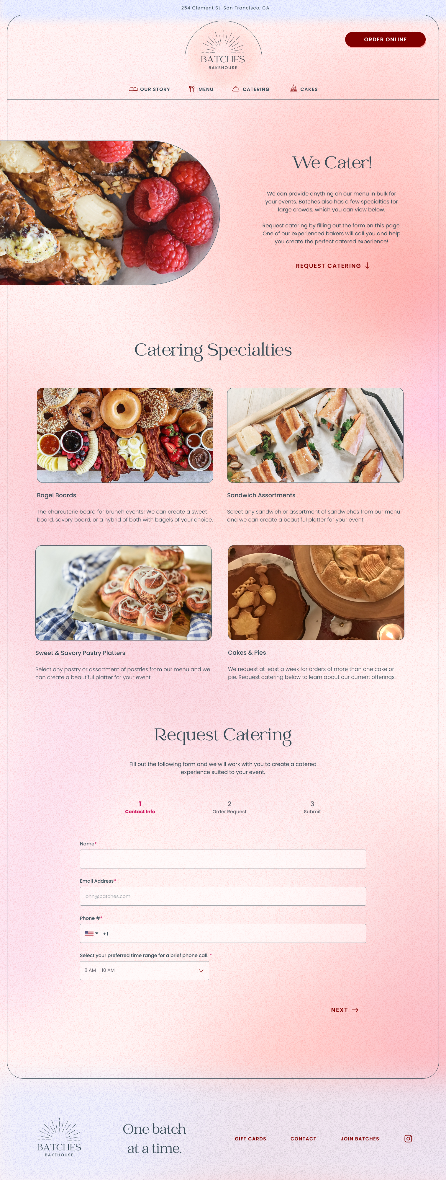
Before
Users weren’t clear on what their options were for catering, and wanted to be able to order directly from a clickable menu that included all the options.
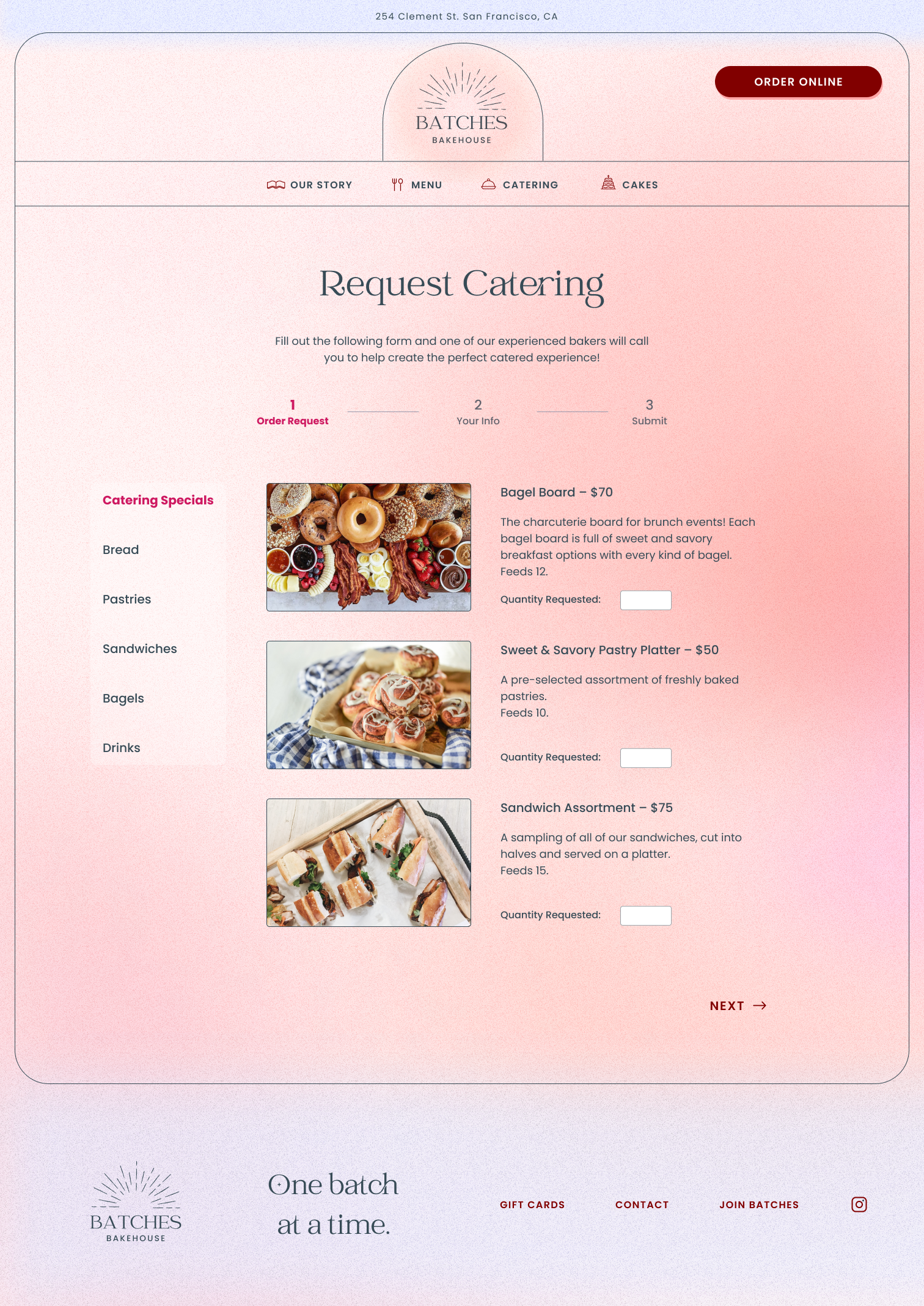
After
I integrated the order form with the menu in an experience that is more familiar to users.
I also moved the primary action above the fold to reduce the need for too much scrolling.
The Final Landing Page Experience
Reflection
Reflection & Next Steps
Though I had lots of inspiration and standard design patterns to follow for a bakery ordering system, it was unexpectedly challenging to create a website presence for a business that was still in its ideation phase. Minds are changing frequently during this stage, clients get busy, and they don't have a product or physical store to showcase yet. Because of this, I had to be comfortable with adding some of my creativity and taking some liberties to establish the brand's personality.
The clients are excited about where the project landed, and when the bakery gets closer to opening, they plan to hire a developer and make this a reality.
More case studies
SF Women's Social ClubBrand Identity & Website
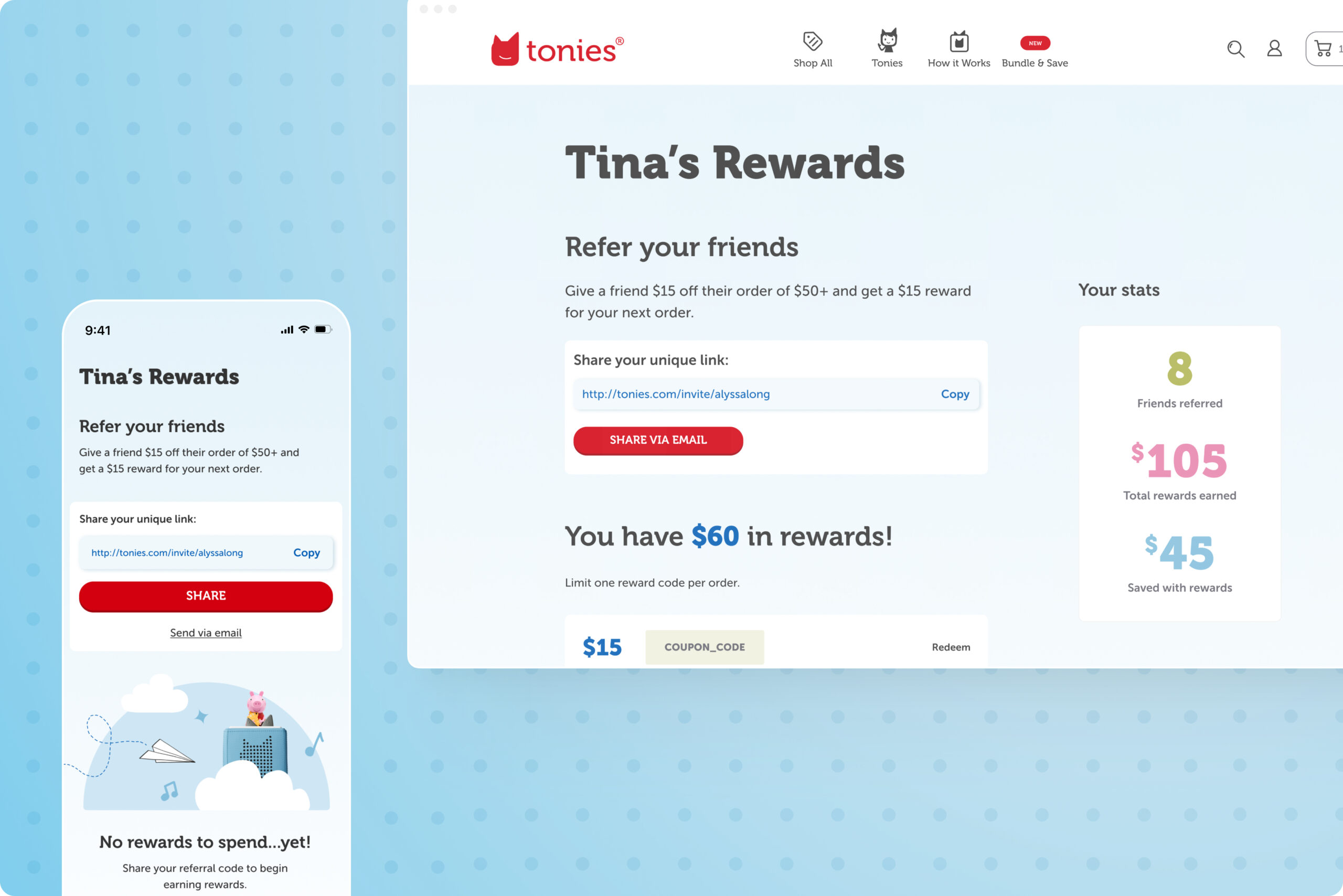
toniesUX Design

GovernClient Project
Too Good to GoProof of Concept