Too Good to Go: The Daily Gallery
Imagining a user-generated photo gallery feature that encourages users to reduce food waste in their neighborhoods by purchasing unsold food.

PROJECT TYPE
Proof of Concept
MY ROLE
User Research
Wireframing
Prototyping
Usablity Testing
TOOLS
Figma
DURATION
4 Months (2023)
OVERVIEW
How can leftover food be made more enticing?
Ever since I moved to San Francisco, the Too Good to Go app has been a way for me to explore new restaurants and markets in my neighborhood by reserving Surprise Bags – grab bags of unsold food sold to locals at a steep discount. All you do is claim the bag in the app, then go pick it up during the allocated time window. It's a win for me, it's a win for the restaurants, and it's a win for the environment!
So – when is a surprise too much of a surprise? This app is not for picky eaters. Unsurprisingly, though, many of the negative reviews in the App Store are about the lack of predictability. The ethos of the app is "you get what you get," so there's no way to see written reviews of a restaurant's Surprise Bag – it's just a star rating. According to Too Good to Go, this is because there's no telling what a restaurant will have left over at the end of the day.
Even the least picky users, who I interviewed, expressed wanting to see what they could get. What an interesting design challenge – to stay true to the sentiment of the Surprise Bag while providing some hints and inspiration!
THE PROBLEM
Blindly purchasing food from a restaurant, even at a discount, is a risky choice without photos or reviews to reference. Unsold food will still go to waste if users do not trust its quality.
THE SOLUTION
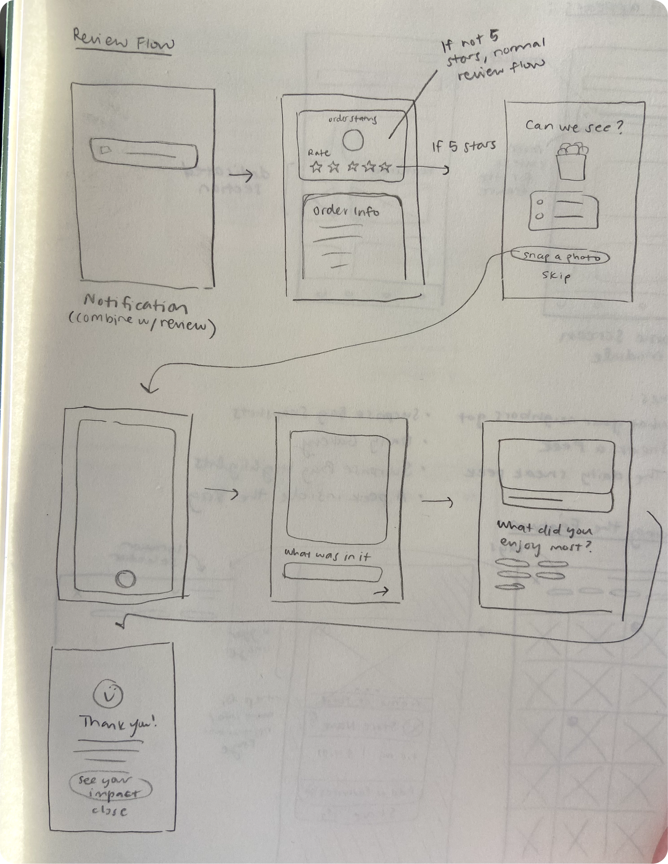
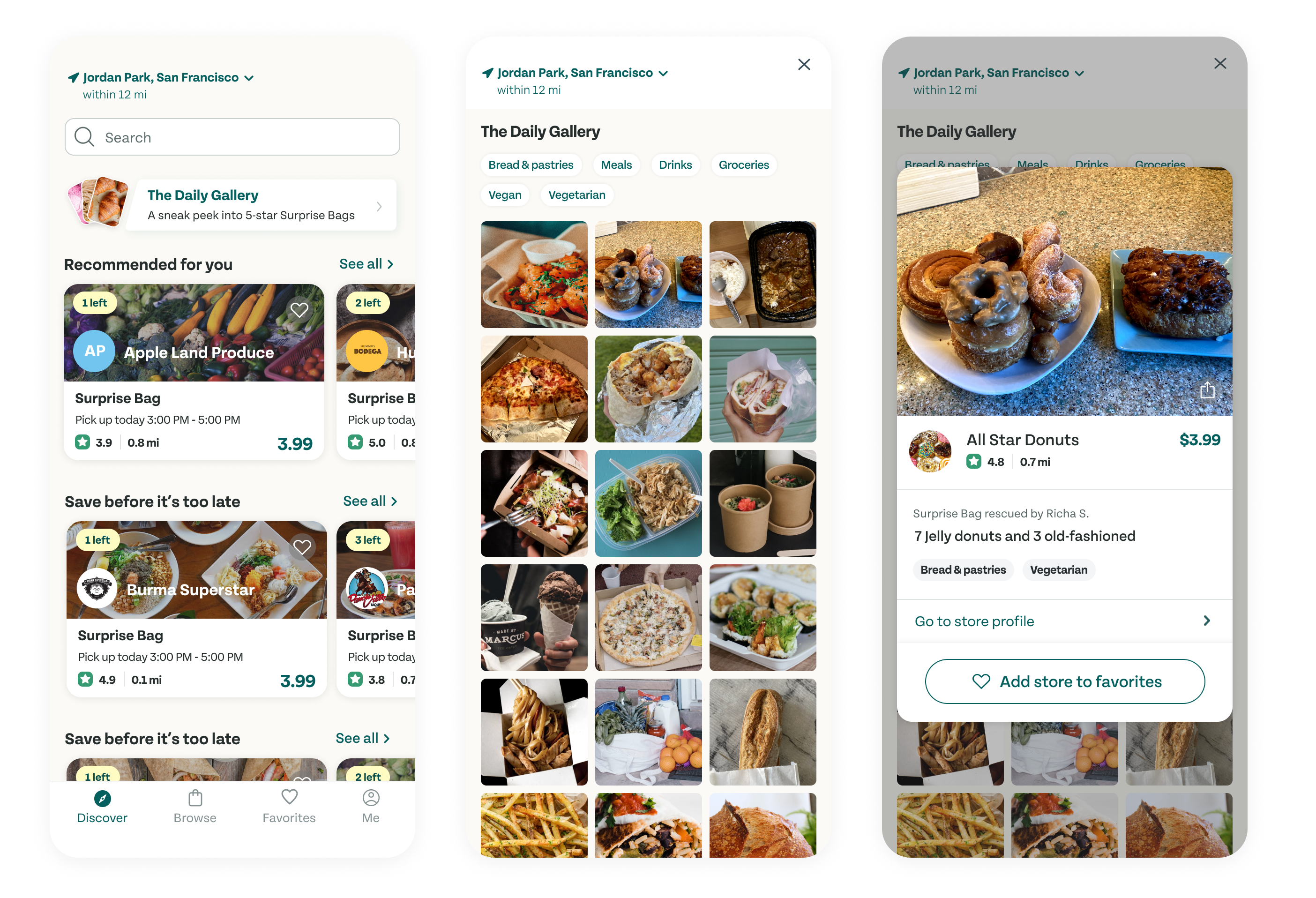
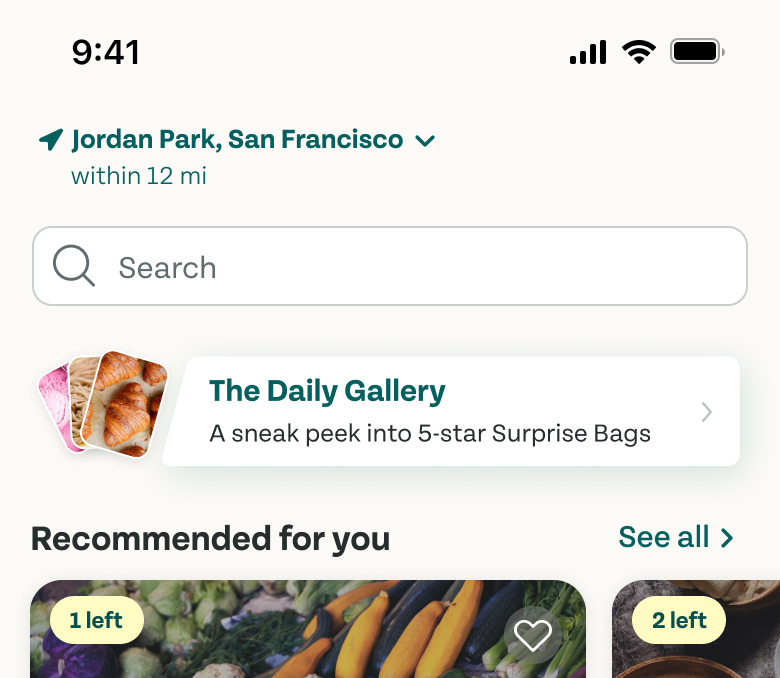
Within the review flow, I added a way for users to share photos of their "rescued" food that could be featured in a photo gallery, refreshed daily.
Snap a photo to share with the community seamlessly as part of the review flow.
In the Daily Gallery, sneak a peek into other users' Surprise Bags and add restaurants to Favorites.
USER INTERVIEWS
Let's rewind. This project began because I hypothesized that a delivery feature might be helpful.
Part of the experience of picking up a Surprise Bag from Too Good to Go is that the user must go to the store in-person, often after business hours. My initial assumption was that this is inconvenient for many people who aren't comfortable traveling in the dark to pick up food that they may or may not like. I thought a delivery feature could address this issue, and it could also provide a way for people with disabilities to use the app, too.
Of course, this was just a hypothesis. I interviewed five Too Good to Go users over Zoom and asked them all about their experiences. I was curious about what they enjoyed, their motivations for using the app, and ultimately their pain points so that I could devise a solution.
One limitation of my research was time, so I was only able to access four people from San Francisco and one from L.A. It is possible that users from suburbs, other states, or other countries could have much different experiences.
Objectives for 1:1 Interviews
- Understand why people decide to download Too Good to Go
- Discover what attracts or deters people from ordering Too Good to Go, if anything
- Find out what situations make Too Good to Go convenient or inconvenient
- Discover what people feel as they order from Too Good to Go
- Understand people’s relationships with delivery services
FINDINGS & ANALYSIS
Interviewing users, I learned that people do not always want convenience – it's often the enemy of satisfaction.
I quickly found that a delivery feature would not be worth developing. People reported being in a different mindset when they ordered food for delivery versus "rescuing" a Surprise Bag on Too Good to Go. The latter is considered more of an unreliable novelty, like gambling.
Plus, going to pick up the food and talking to a real person is fun for people – not to mention more human. Users get to experience a restaurant they might not have gone to otherwise, and be handed a bag full of goodies by a smiling stranger. It's a refreshing change from hiding behind our devices all day.
I organized the insights in an affinity map to uncover patterns.

A portion of my affinity map
Major Findings
- Users reported not feeling very experimental when ordering food from a delivery app, since they don't want to be disappointed. They open these apps when they feel low-energy or want something specific.
- The users I interviewed don't consider Too Good to Go to be the most reliable source of food. It is more of a feel-good treat once in a while to experiment with local spots. Users accept the experience for what it is – a gamble.
- People generally enjoy the process of going in-person to pick up the Surprise Bags. They tend to open the app when they are feeling spontaneous. 4/5 users mentioned having fun interacting with the community when they pick up their bags.
- Every participant mentioned wanting some sort of insight as to what could be in the bags. Unsurprisingly, people value reviews when making a purchase, even though this goes against the element of surprise.
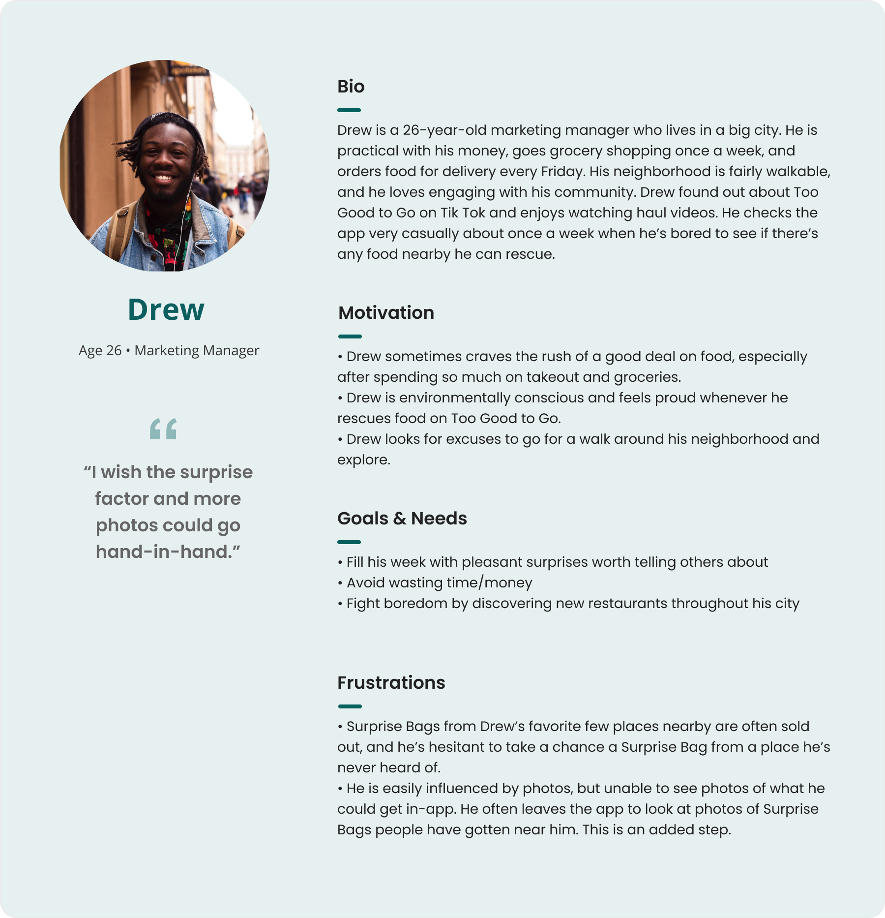
Persona
I created a persona to synthesize the patterns of goals, motivations, and pain points users reported.
PIVOTING
How do I address a clear user pain point while also staying true to the surprise factor of Too Good to Go?
Everyone I talked to mentioned wanting at least a hint of what they could get in a Surprise Bag. But doesn't this go against the "you get what you get" premise of the app? Wouldn't fully disclosing the contents of each bag would ruin the novelty that people also reported enjoying?
I broke out my sketchbook and brainstormed some options. I landed on an idea to create a daily feature of Surprise Bags that refreshes every 24 hours.
DESIGN
What if users could post their own photos of their Surprise Bags and view others in a daily sneak peek?
One user said something interesting during our interview; she mentioned that Too Good to Go is on rotation with her daily social media apps. Even though it isn't a social media app by any means, a common comment was that it is fun and novel to check and scroll through to see what's available in the neighborhood.
The result of my brainstorming was to design a feature similar to Instagram or Snapchat stories that users could tap through to view others' hauls and get inspired to rescue more bags. Similarly, people are inspired to gamble at casinos when they hear stories of real people like them winning! I felt that the same logic could apply.
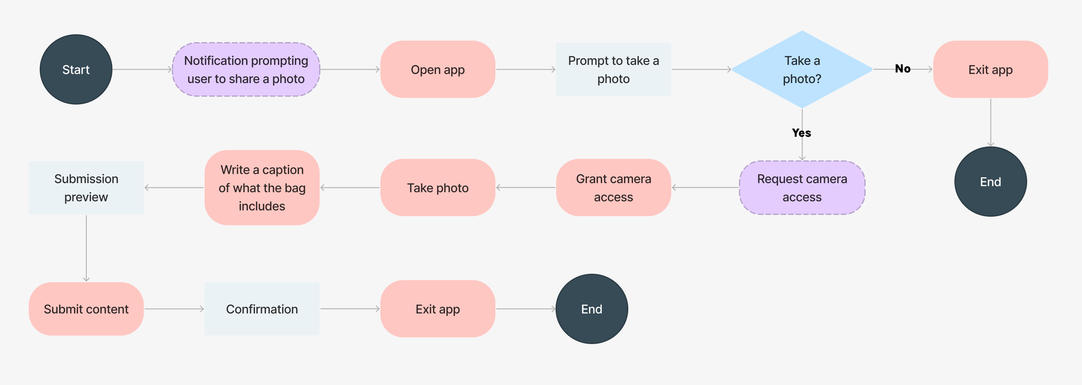
USER FLOW
I outlined two user flows, one for viewing the content and one for creating it.
User Flow: Viewing the Surprise Bag Gallery
Drew opens Too Good to Go one night and scrolls through the Discover page for something new. He notices a new module. Out of curiosity, he clicks into it before checking available bags.
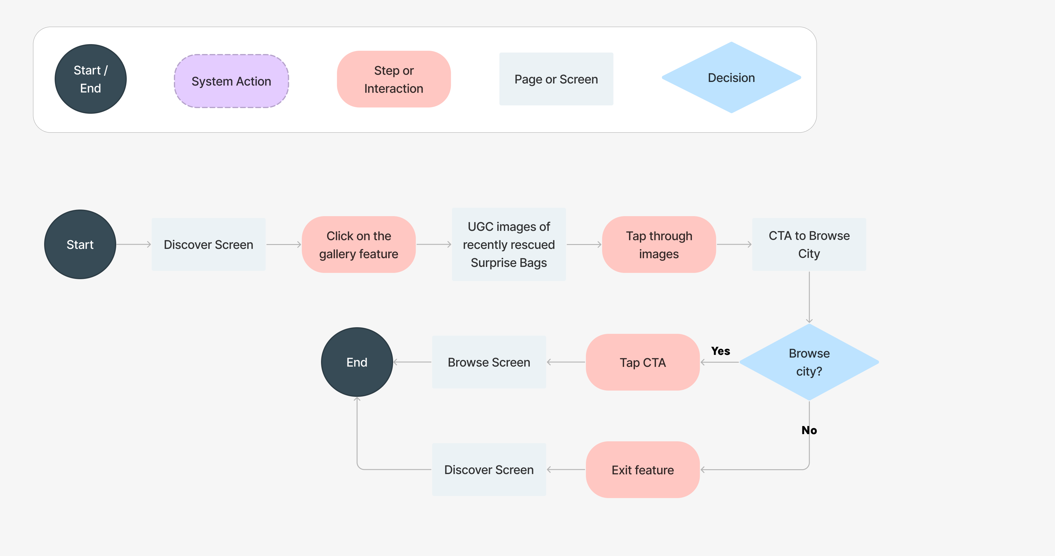
User Flow: Sharing a Photo
Drew has just picked up a Surprise Bag. He is prompted with a notification to take a picture of his "haul" for a chance to be featured on the Discover page. He opens the app to check it out.

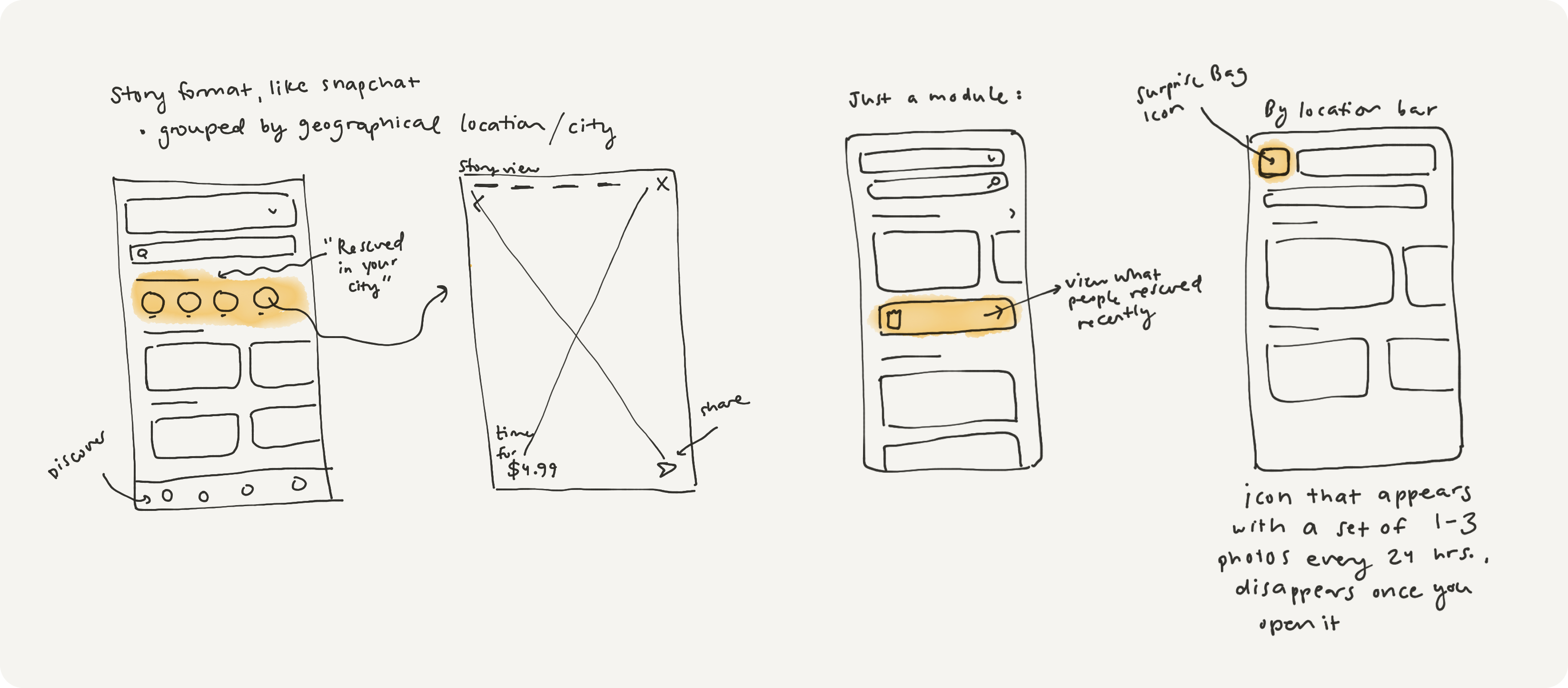
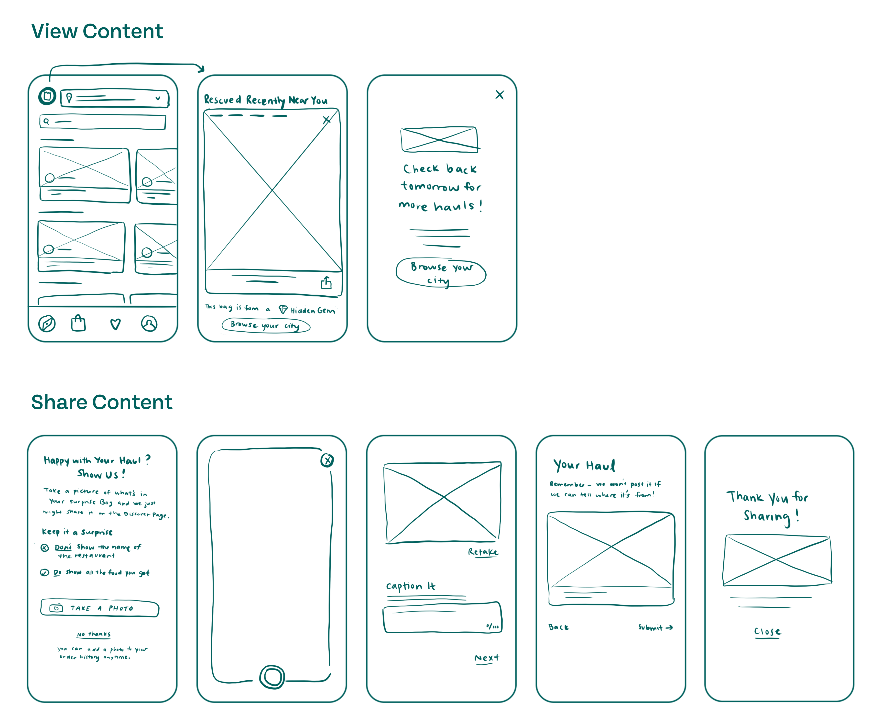
LOW FIDELITY WIREFRAMES
I began sketching out layouts for each screen for each step that would be necessary to design.
I decided to go with a button view that would open up into a story that users could tap through. I made it small and unobtrusive to keep it out of the way of primary app functions, but differently shaped and static at the top so that it stands out enough for users to check regularly.
MID-FIDELITY WIREFRAMES
I laid out the screens in a higher fidelity to focus on functionality, leaving out visual design frills.
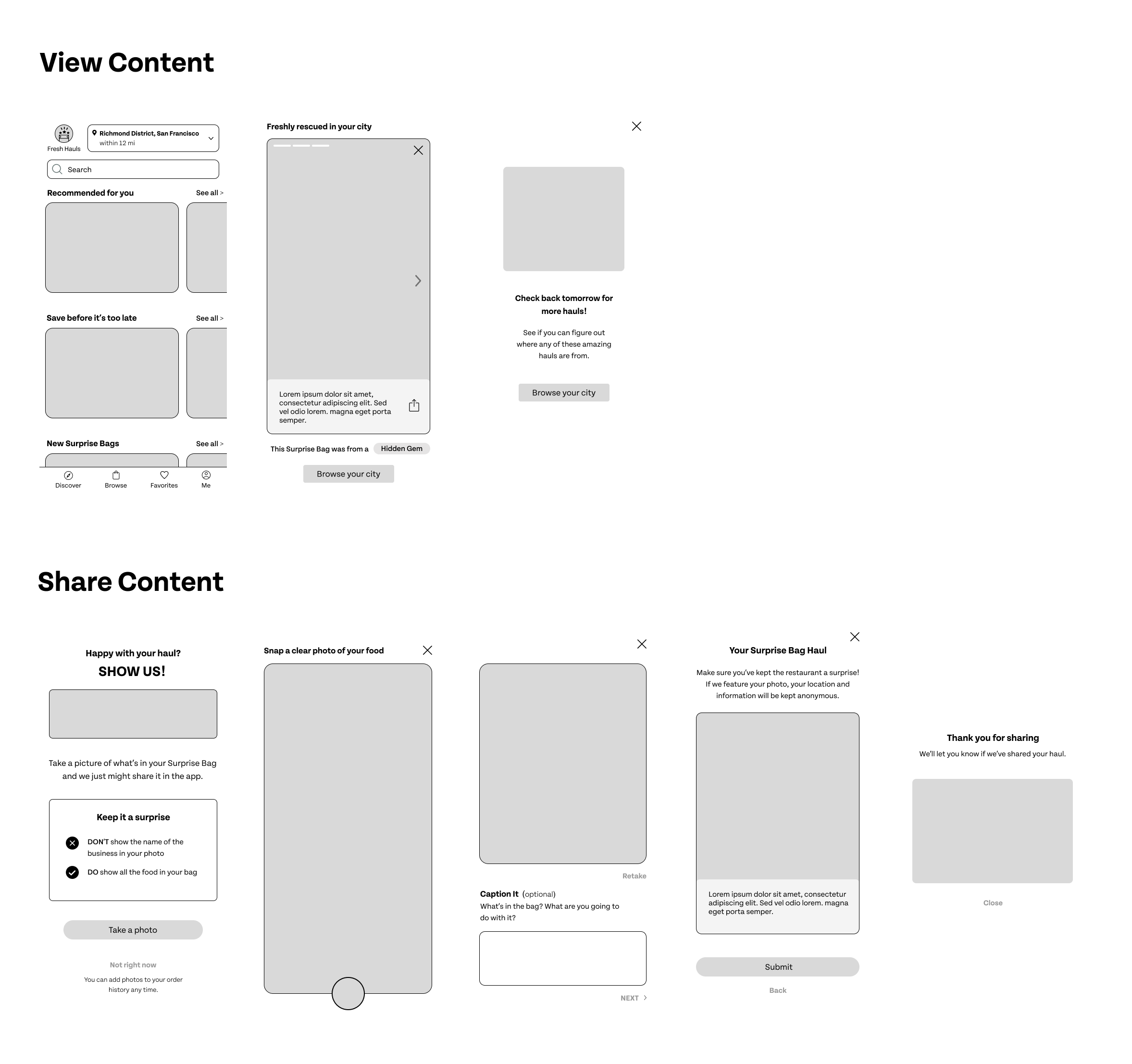
HIGH FIDELITY PROTOTYPE
This was my first round of high-fidelity screens.
Between the mid and high fidelities, I decided to go with a feed view instead of a story view, since I figured stories are primarily a social feature. I also decided to call the feature "Local Hauls."
View Content

Share Content
USABILITY TESTING
I tested five users' understanding of the new feature and their ability to navigate it without aid.
Spoiler alert: they didn't get it.
I asked users to first use the feature to view others' Surprise Bags, and then complete the post-pickup flow of sharing their own Surprise Bag image.
- Without tapping into the new feature, it was not clear to most participants what the feature would do. The icon and "Local Hauls" label were unclear.
- The new feature was difficult to find for most participants.
- When looking at the feed, all users said it looked like a list of reviews.
- Most were confused about who the reviews were coming from – a user or the store itself?
- All participants were confused by the fact that the restaurant names and distances were kept a secret.

In trying to keep the spirit of the surprise alive, I had created a frustrating mystery. I had assumed that users would see the photos as a hint of what they could get in their general area, and that they could try to guess where the Surprise Bags came from for fun. In reality, none of the users thought this was fun at all. They wanted to know where exactly the photo came from – who took it and where to find the food.
PIVOTING AGAIN
I went back to the drawing board.
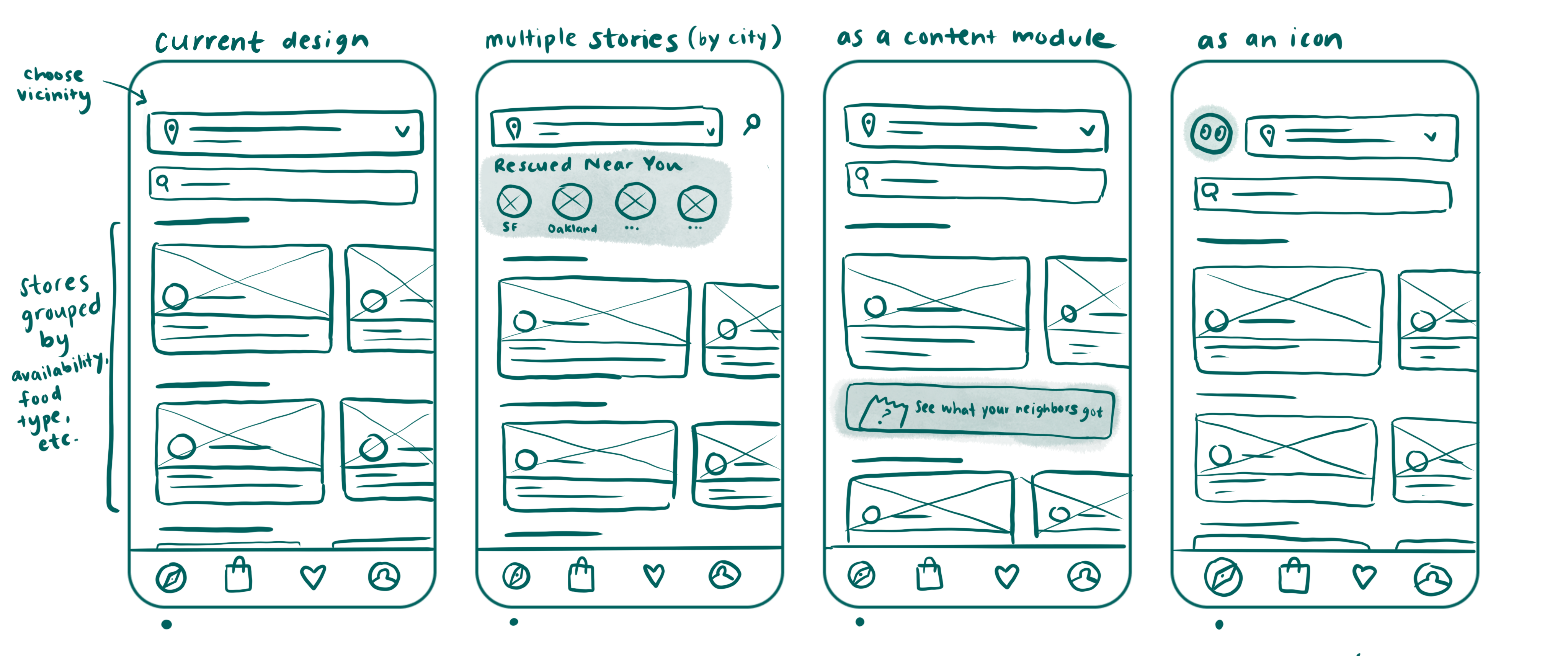
I took out my sketchbook and explored some options for making this feature more clear and relevant to users.
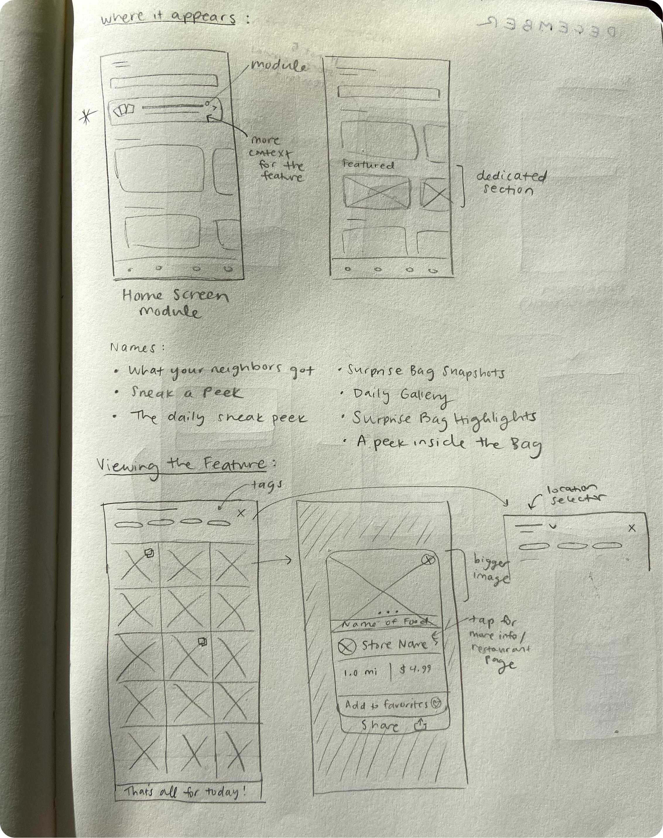
- I sketched a module rather than a button, so I'd have space to provide context about the feature. This would also make the feature more obvious on the screen.
- I brainstormed several names for the feature, and ultimately decided on The Daily Gallery.
- I sketched what a popup could look like if someone selected one of the images, which wasn't possible in the previous iteration. This popup includes the name of the restaurant, the distance, the reviewer's name, a blurb about the contents of the bag, and the ability to add the store to your favorites.
- I made the photo sharing process part of the review process, since users reported that they associate sharing their experience with leaving a review.
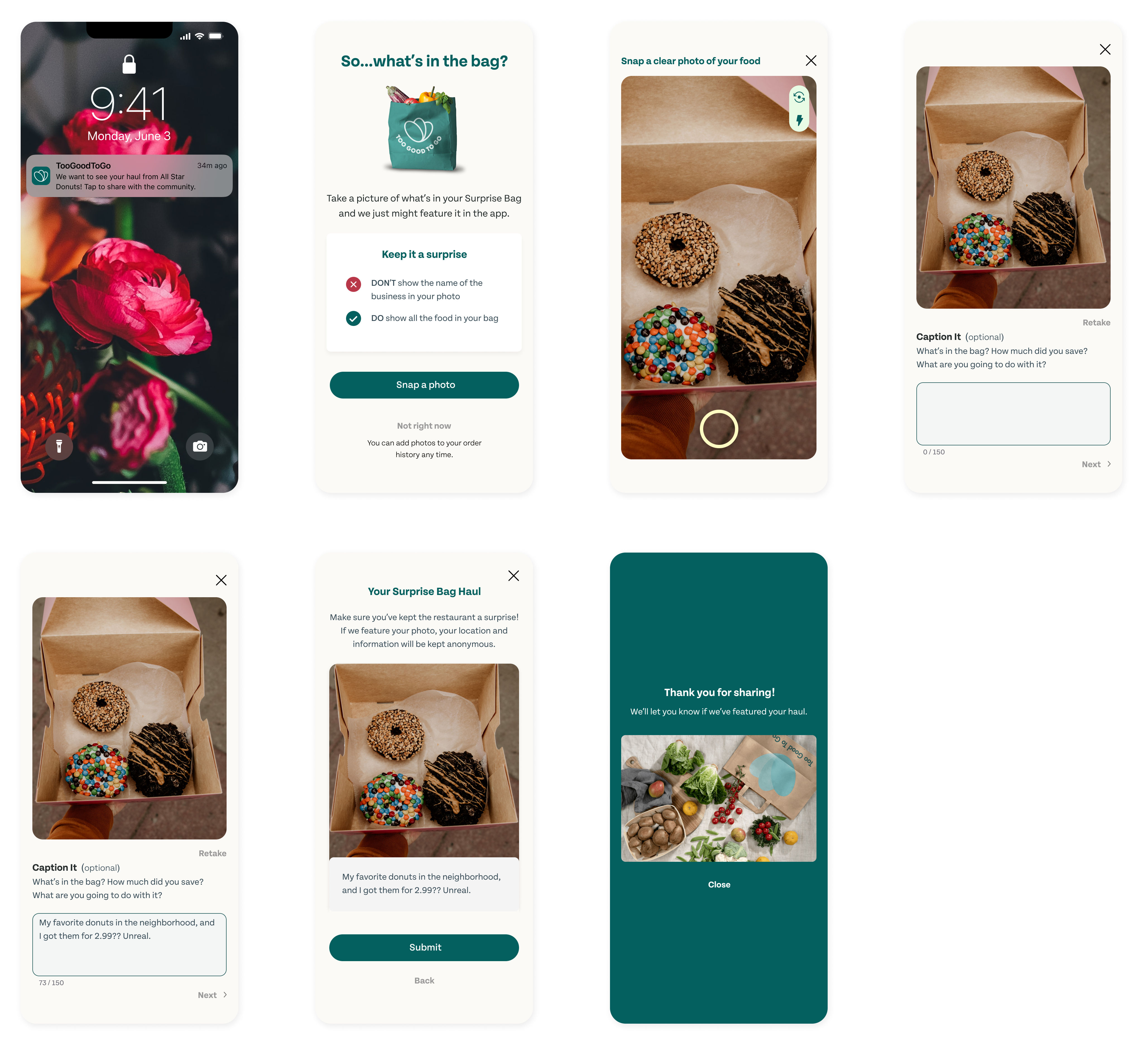
THE FINAL DESIGN
The new design gives users a hint of what they could get, but it doesn't spoil the surprise.
Though users are able to see what a past user has rescued from a restaurant, there's still novelty in the fact that they can't know for sure what will be in their own Surprise Bag. Also, The Daily Gallery is refreshed every 24 hours with random, city-wide images, so users can't just go to a specific store profile and expect to see what they could get.
UNMODERATED USABILITY TEST
With limited time, I asked the same users to test the feature with an unmoderated usability test.
This time, all users thought the purpose of the module was clear. They all reported that it would positively impact how they currently use the app.
"I loved seeing the name and star rating with the image. I would definitely be more apt to try and get a really great bag, like one that was featured here."
– Participant 5
One issue came up with a 70% misclick rate on the Daily Gallery module. Users did not immediately recognize it as a new feature.
A map showing where users tapped when they were asked to locate the new feature.
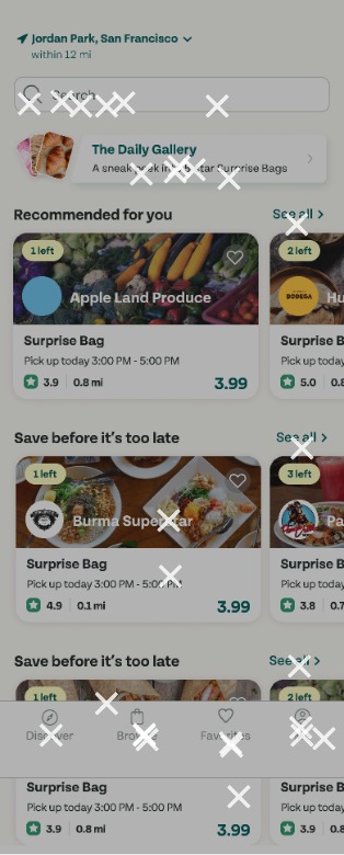
My solution: to make the glow around the feature brighter and the module taller.
REFLECTION
This project was full of hiccups, but the good kind! Here's what I learned.
Convenience is not always the answer.
When I think of a food app, I think of delivery. It's the obvious choice for a feature that makes life more convenient. But there are already SO many digital ways to make life convenient, to the point where I feel that convenience can detract from human design in certain cases.
Humans are social and curious, and I feel that this feature concept brings out these qualities while also simply making the app more delightful.
It's important to be able to abandon a concept early and pivot when necessary.
I was so excited to go into this project with an idea for a feature already in mind, and I was proven completely wrong by my user interviews! If I had tried to make a delivery feature work, I would have wasted so much time designing complex flows only to find that users never asked for it.
In addition, after my first round of usability tests, I felt like I had failed because no one understood the feature at first. I was very attached to the idea, but as soon as I allowed myself to diverge a bit from my original thinking, pivoting was't as scary as I expected.

You made it to the bottom! While you're here, let's connect.
LINKEDIN linkedin.com/in/alyssalong13/
Made with lots of love and espresso
ALYSSA LONG | 2024