Virginia Oaks Website Redesign
Working with a team to redesign and rebrand the website for a low-income apartment complex
PROJECT TYPE
Contract
Student Team
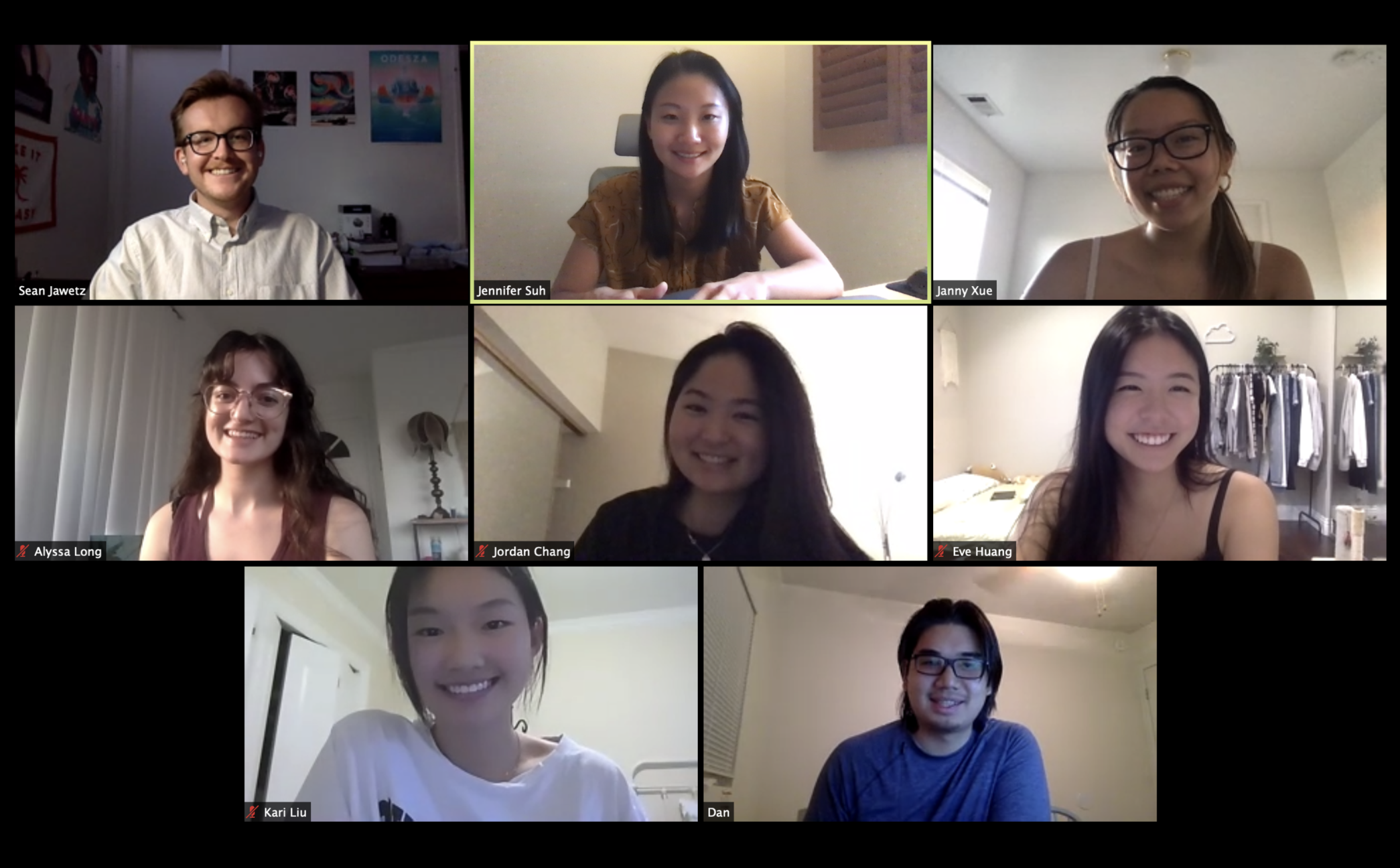
THE TEAM
Eve Huang
Sean Jawetz
Jordan Chang
Kari Liu
Janny Xue
& Myself!
MY ROLE
User Research
Wireframing
Brand Design
TOOLS
Adobe XD
Miro
Wix
DURATION
10 Weeks (2020)
Overview
Virginia Oaks Apartments struggled to attract new tenants in 2020.
Virginia Oaks Apartments in McKinney, Texas offers quality, affordable housing for second-chance applicants, including people with criminal records, low credit, or other backgrounds that prevent them from getting approved elsewhere.
At the beginning of the COVID-19 pandemic, those looking for a place to live were understandably hesitant to visit apartment complexes in person. Dan, the manager of Virginia Oaks Apartments in McKinney, Texas saw a decline in applicants and realized the usability of his website would matter more than ever to prospective tenants.
Dan sought help from Design at UCSB, a club that did pro-bono design work. I joined as one of five UX Designers, and we met bi-weekly over Zoom. This was the takeaway from our kickoff meeting with Dan:
Project Constraints
 We had to use Wix, the existing site builder, so that the manager could maintain the site after our contract was over.
 We did not have access to real users for user testing, so we had to assume that low-income apartment hunters in Southern California held similar values as those in Texas.
Heuristic Analysis
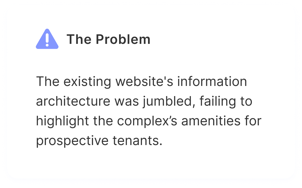
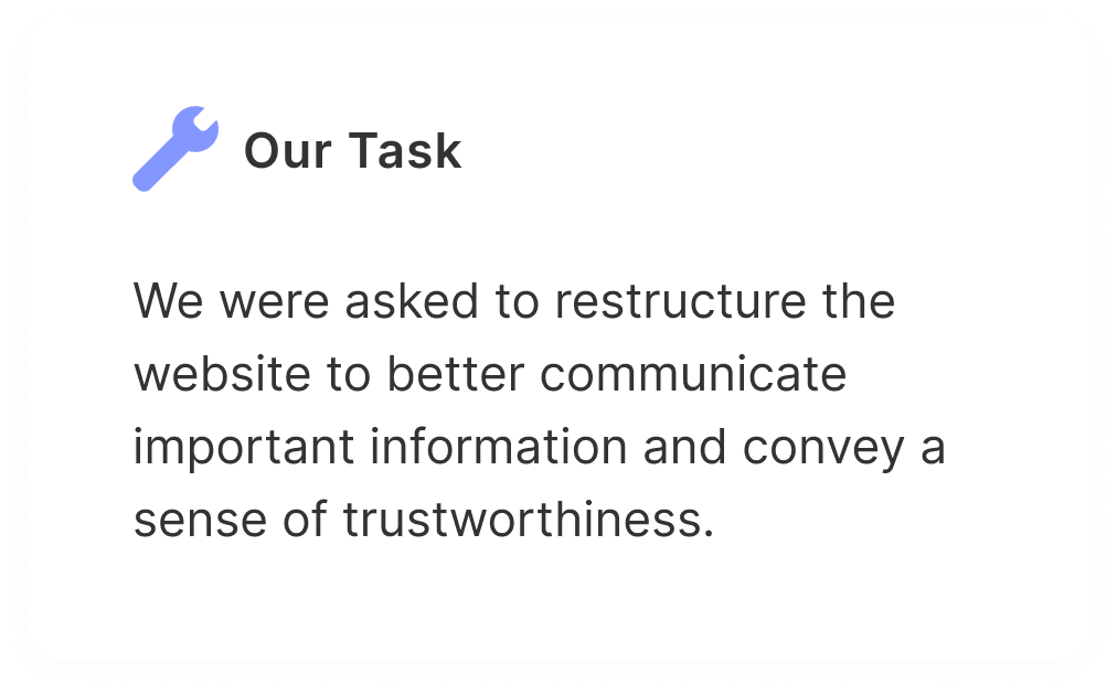
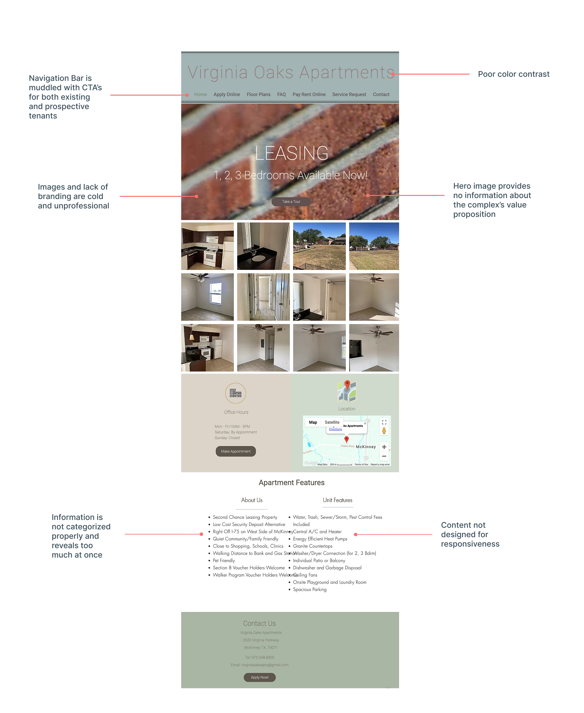
An audit of the existing website revealed general usability issues.
Before diving into user interviews, we took a look at the existing site to pinpoint some objective design pitfalls.
Primary Research
Okay, so what do low-income apartment-hunters really care about?
We found several issues by just analyzing the site on our own, and the business owner came to us with his own problem statement, but we needed to talk to people in the user's shoes. We conducted five interviews over Zoom with people who identified as low-income (made less than 20k annually) and had experience looking for an apartment.
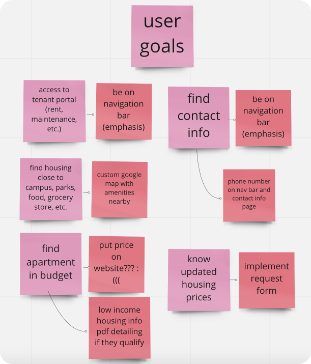
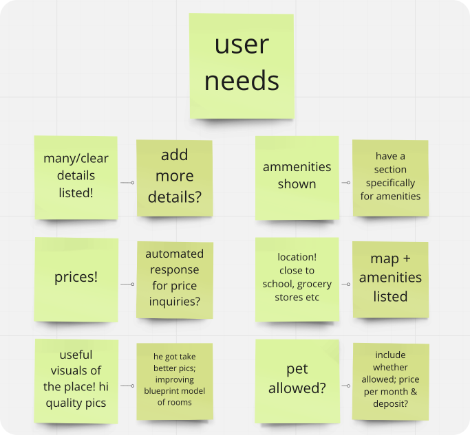
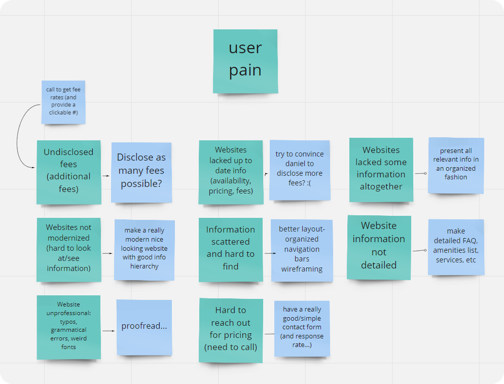
Each of us interviewed one person, then compiled our findings in an affinity map. Significant insights, or ones that were mentioned multiple times, made it into the following charts:
Synthesis
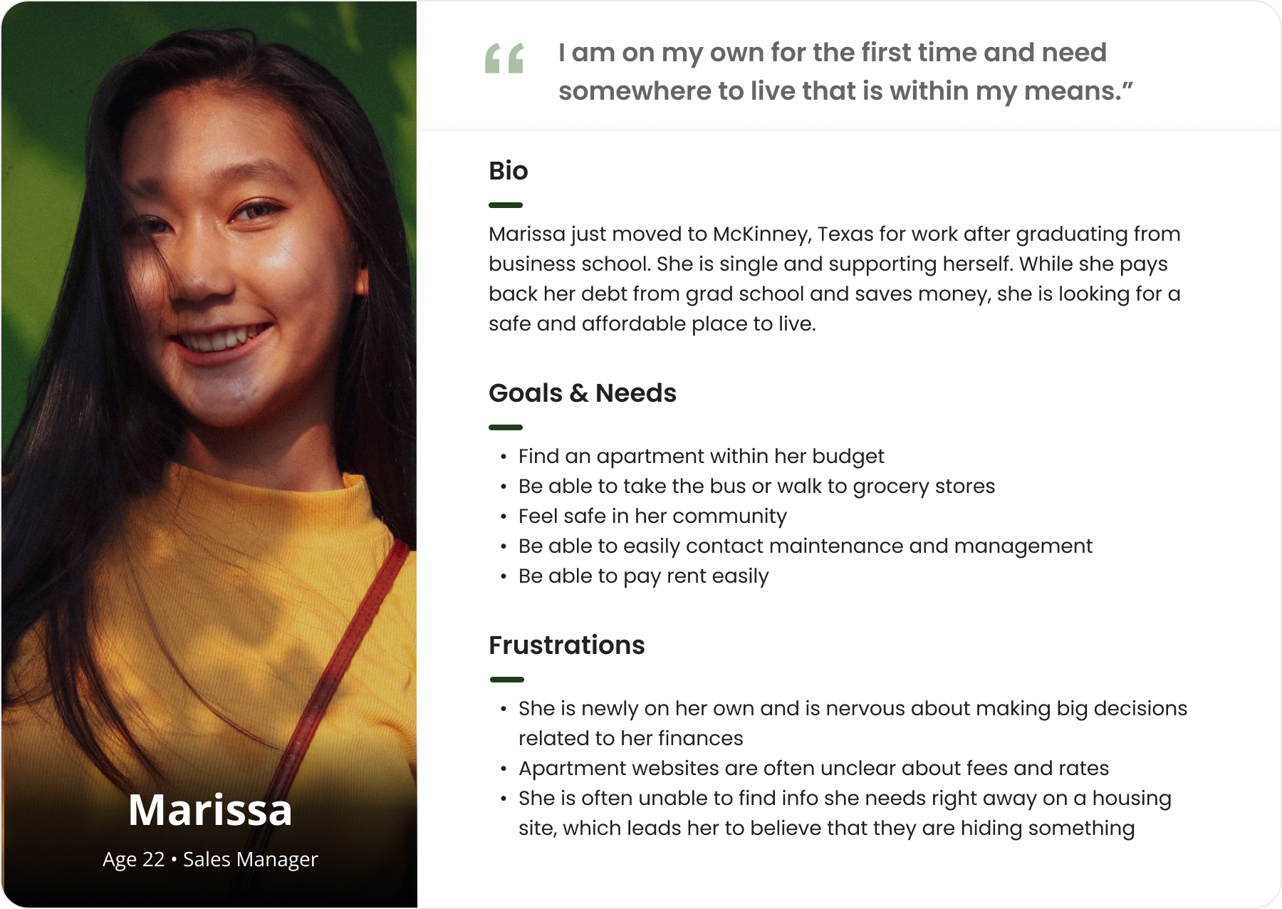
Users care about clarity and support when choosing to trust an apartment complex.
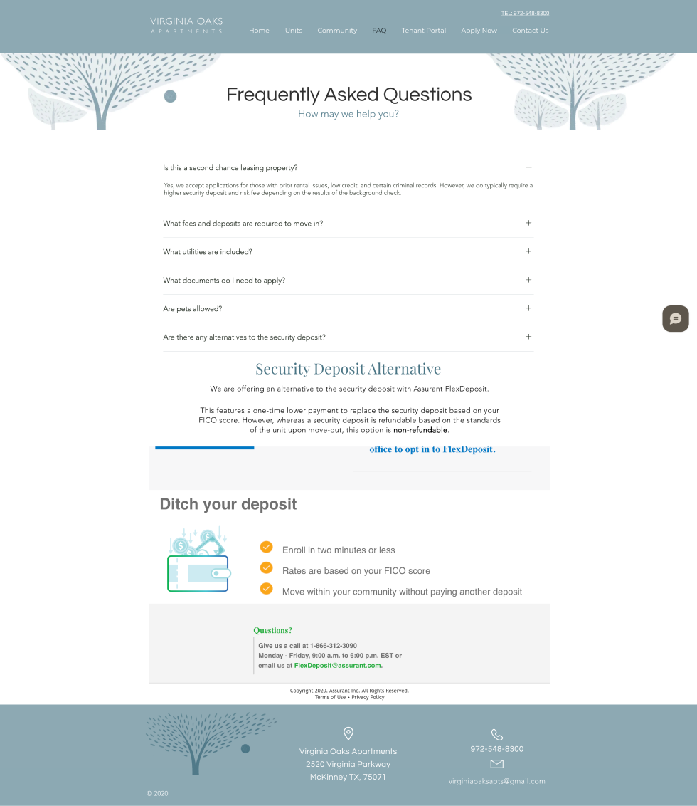
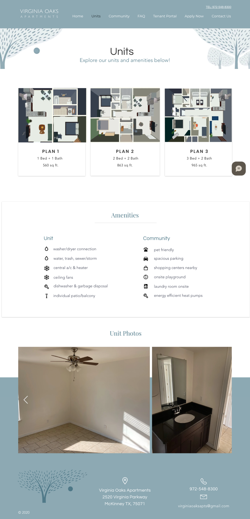
Using common themes from the interviews, we created a persona to share with the business owner. This helped us to convince him that we needed him to take better photos of the complex's amenities and units. It also allowed us to make a case for transparent pricing on the website, though we weren't successful due to Dan's business constraints.
Sitemap
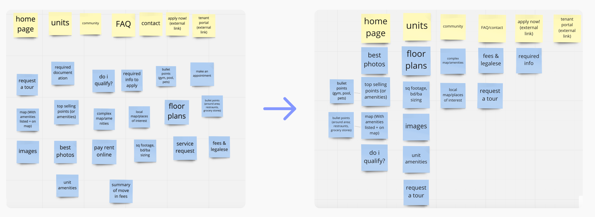
A card-sorting exercise clarified how to best structure the website's content.
Our next step was to figure out how to organize the content on the website in the most intuitive way possible. Since we had differing ideas about how to do so within our team, we decided to each conduct two card-sorting activities using Miro with family and friends. Due to the time constraint, we were unable to source participants that matched the low-income requirement.
We then crafted a sitemap that reflected how most people organized the content.
Design
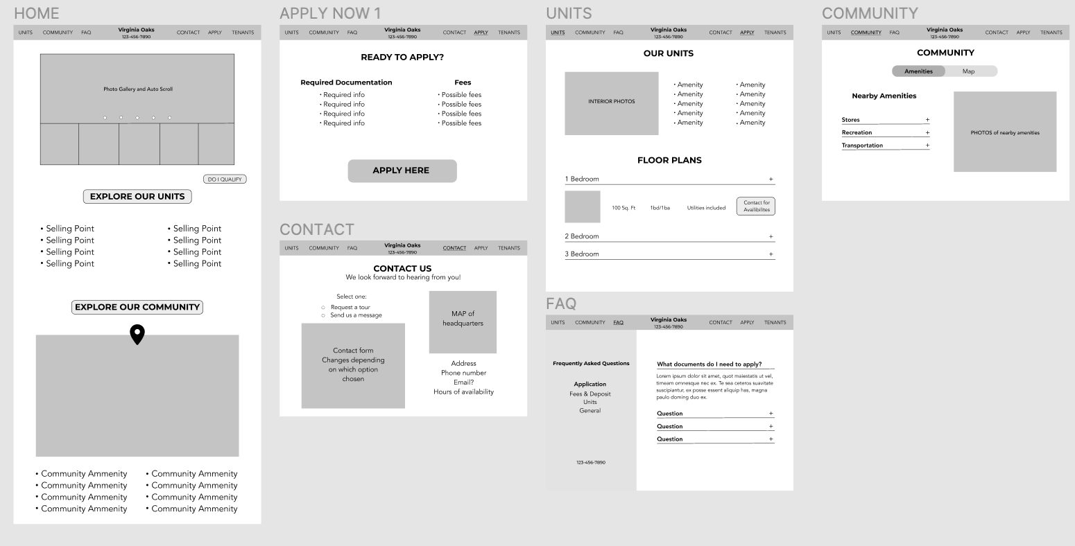
We each drafted two sets of wireframes for two screens, then voted on our favorites.
Diving into Adobe XD for the first time, I worked on the Home screen and Contact screen. I sketched multiple ideas on paper first before creating these.
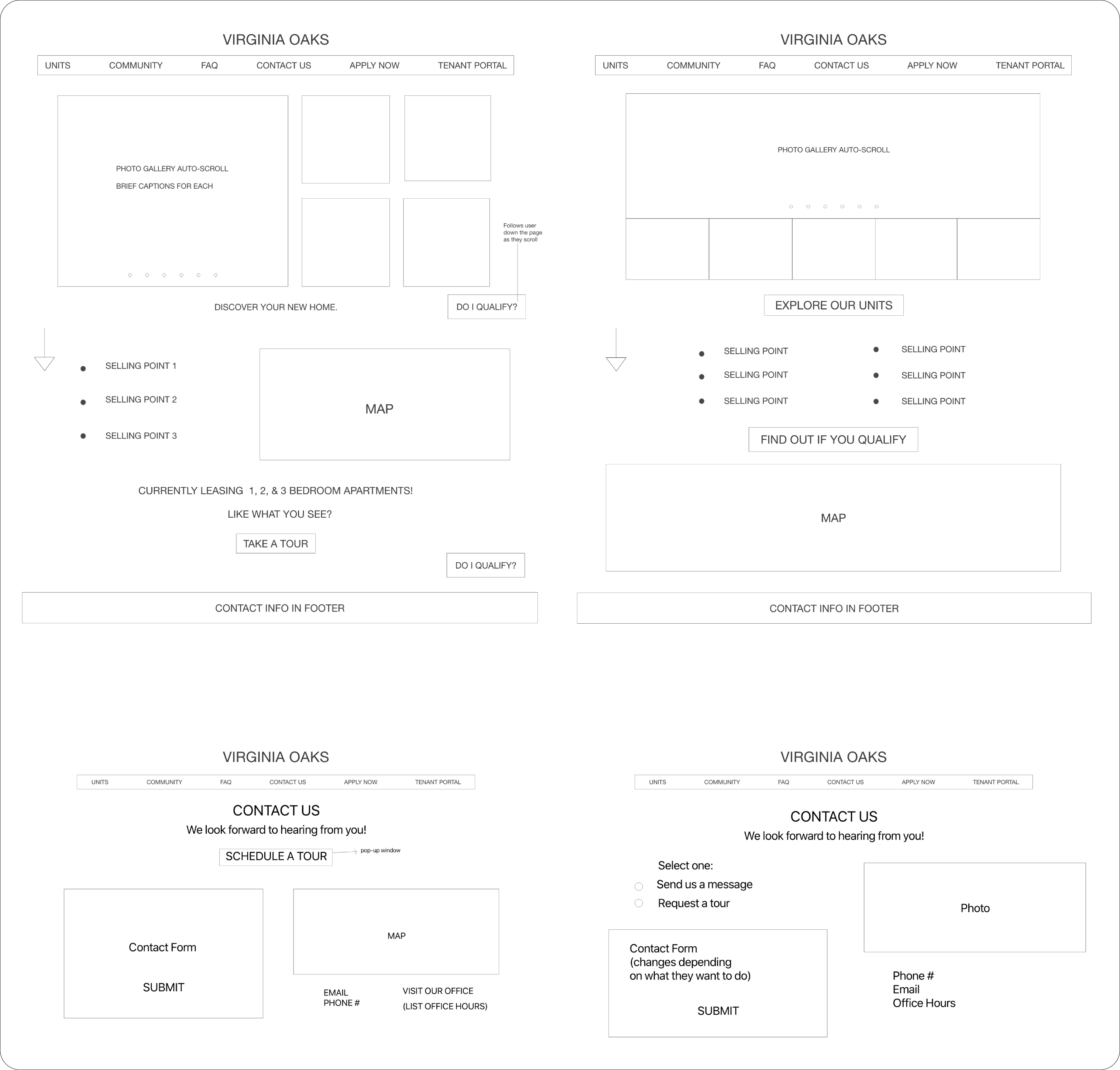
After a couple rounds of iteration, here's what our final mid-fidelity wireframes looked like:
Branding
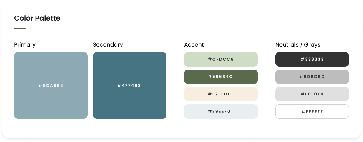
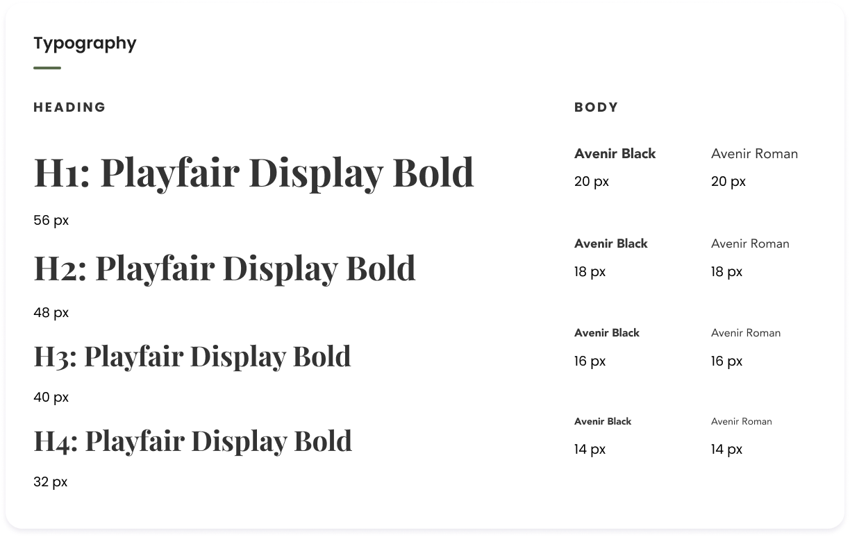
Starting with a few adjectives from the business owner, I led the visual identity change.
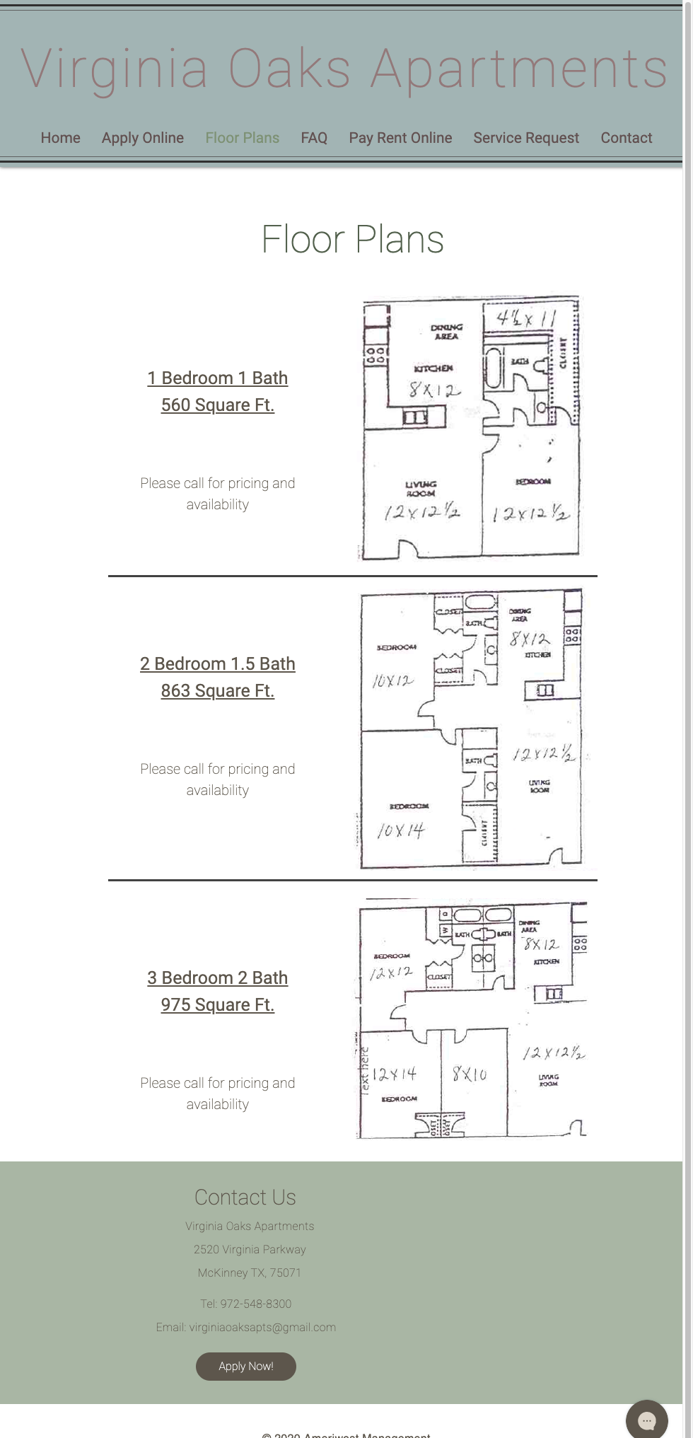
Dan specified that he wanted the website to be modern but comfortable and community-oriented. I explored some color and logo possibilities, integrating "VO" into a nature-inspired scene. Dan liked the one on the right the best, and I created a series of illustrated trees to add a sense of whimsy and consistency throughout the site.
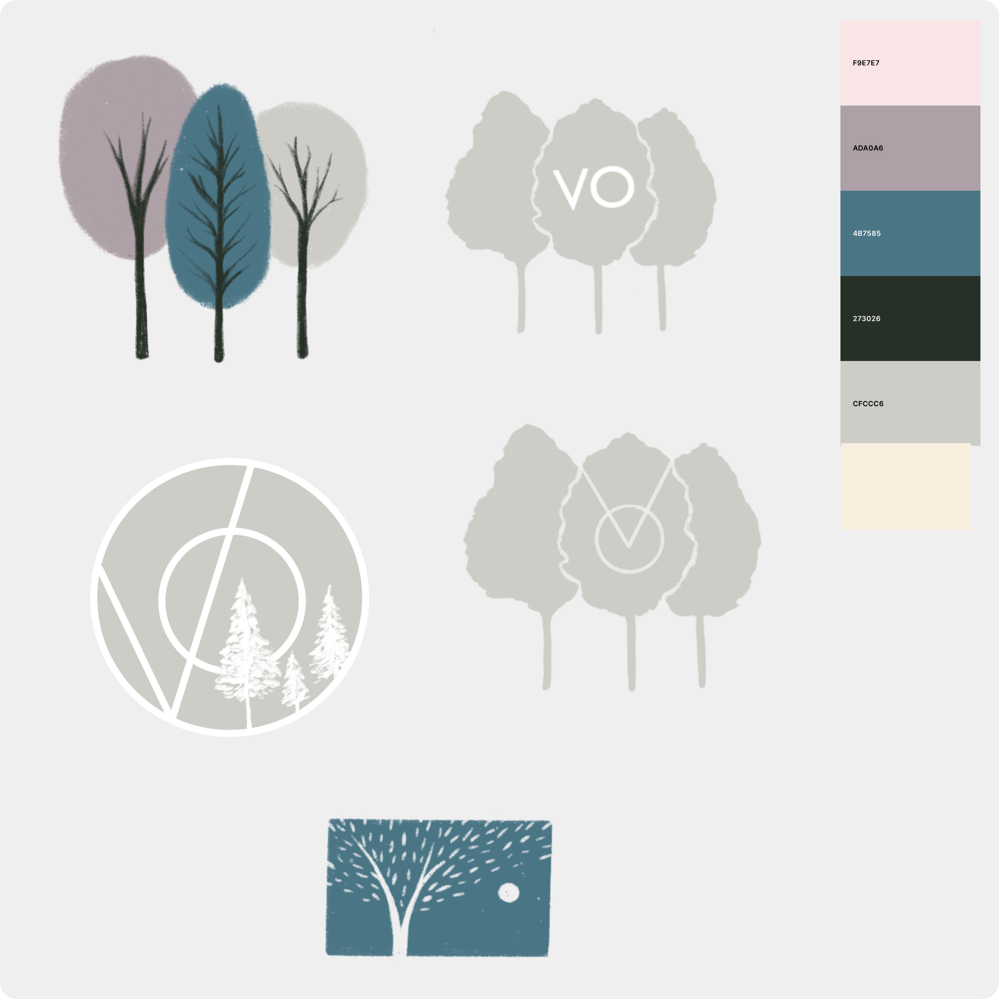
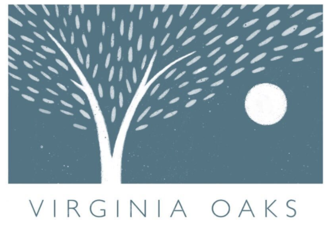
We decided on a cool-toned color palette and typography that was modern, professional, and soothing. We chose Playfair Display to add a sense of friendliness in combination with the illustrated logo.
Prototyping
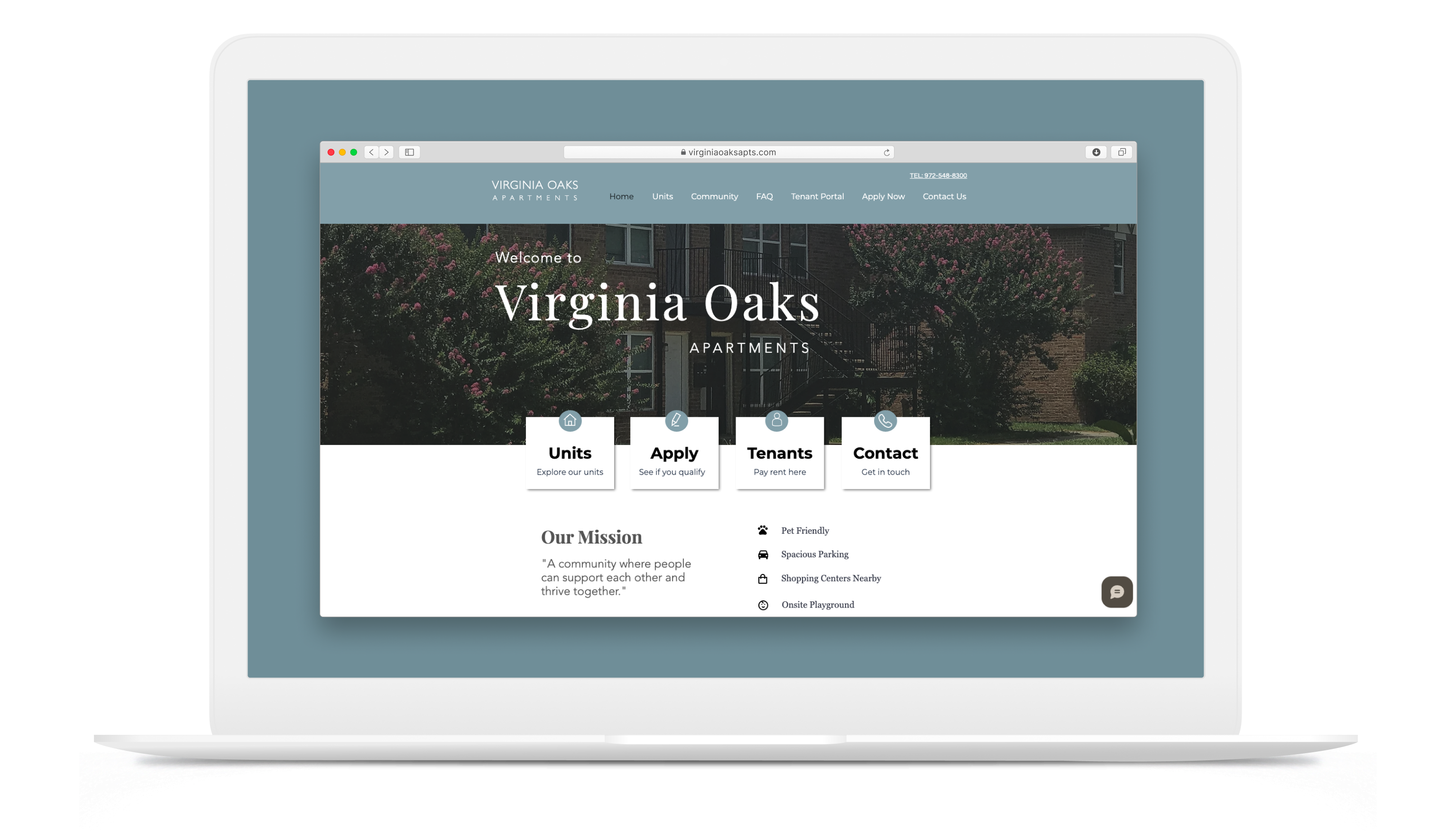
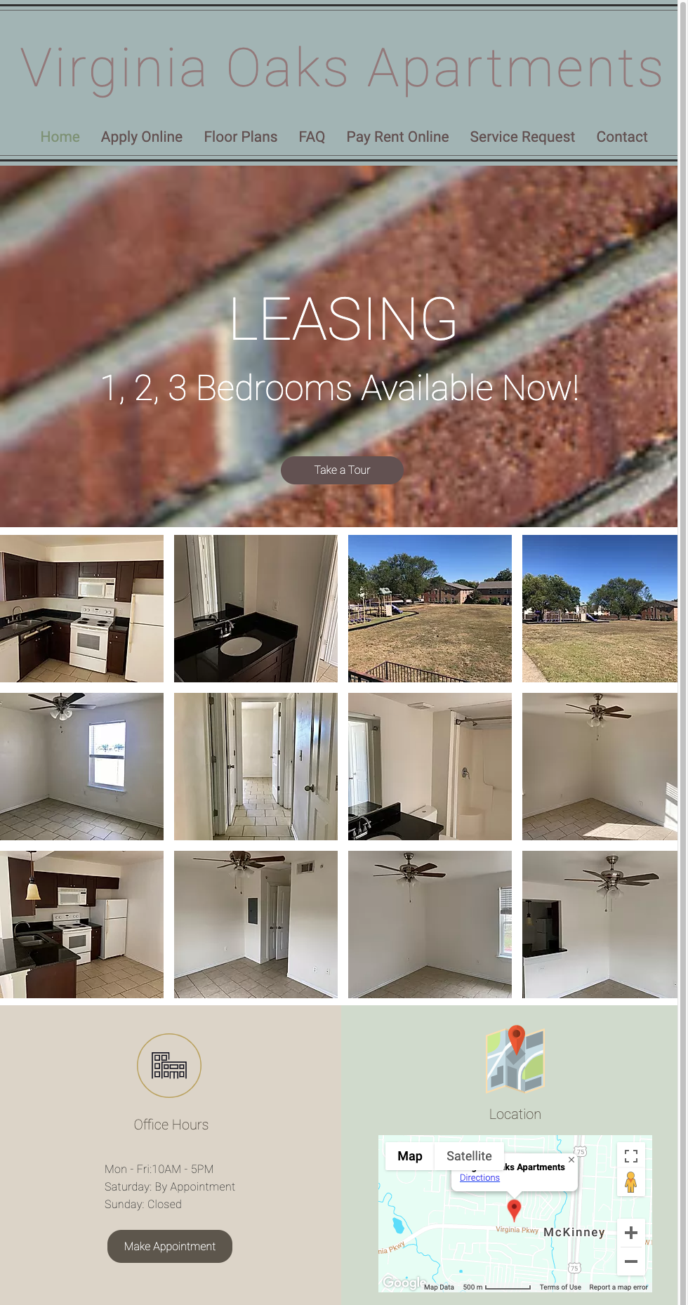
Finally, we built the website as closely as we could to our wireframes within the constraints of the site builder.
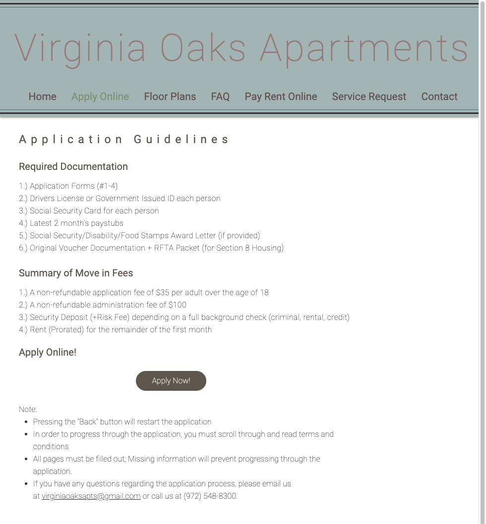
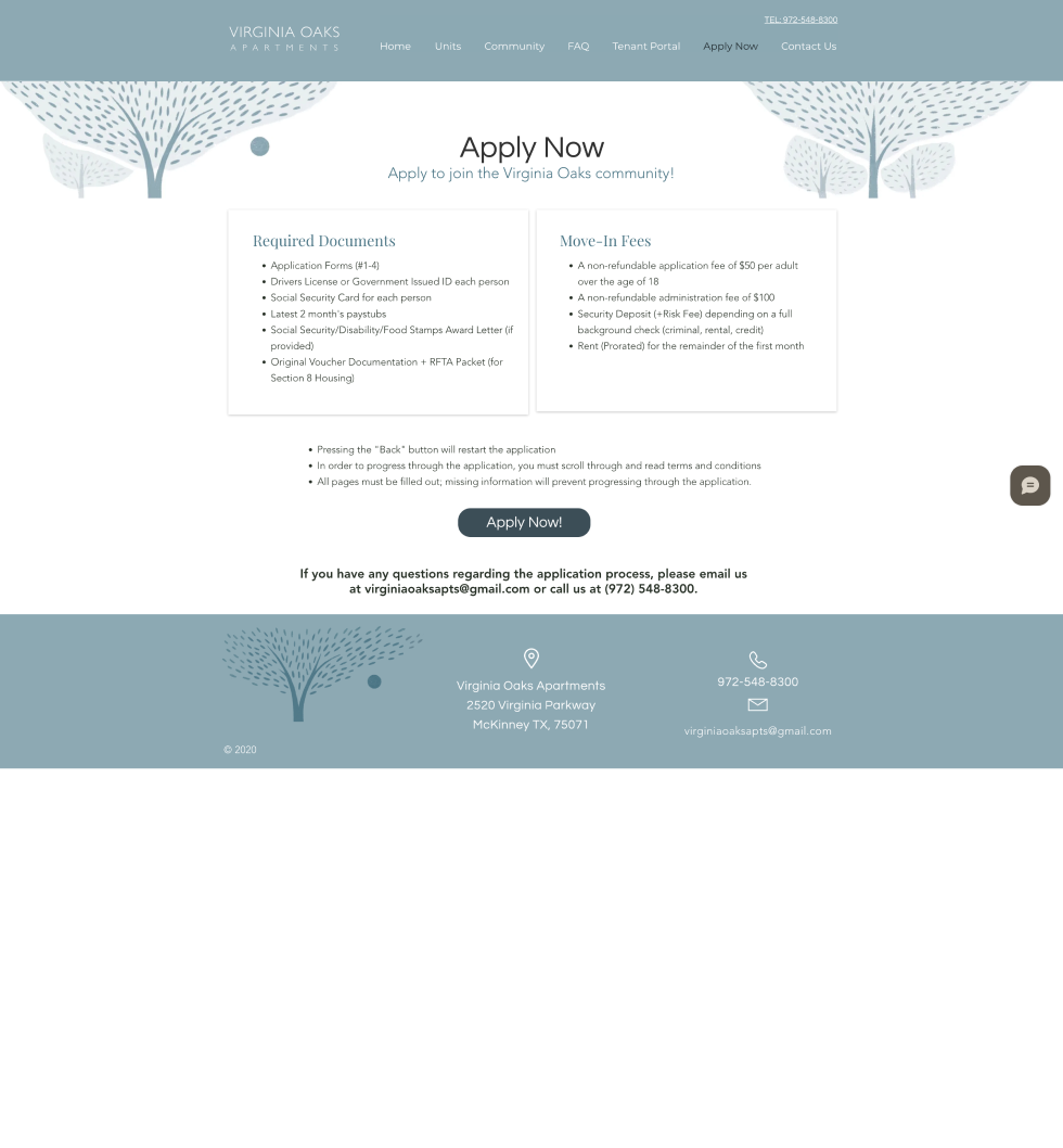
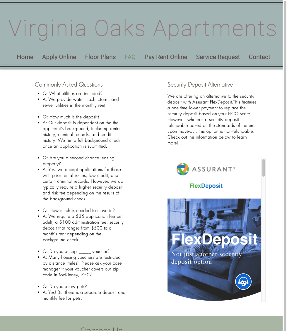
Drag the slider to view the before and after of each screen. You can also view the live website here.
Home Page
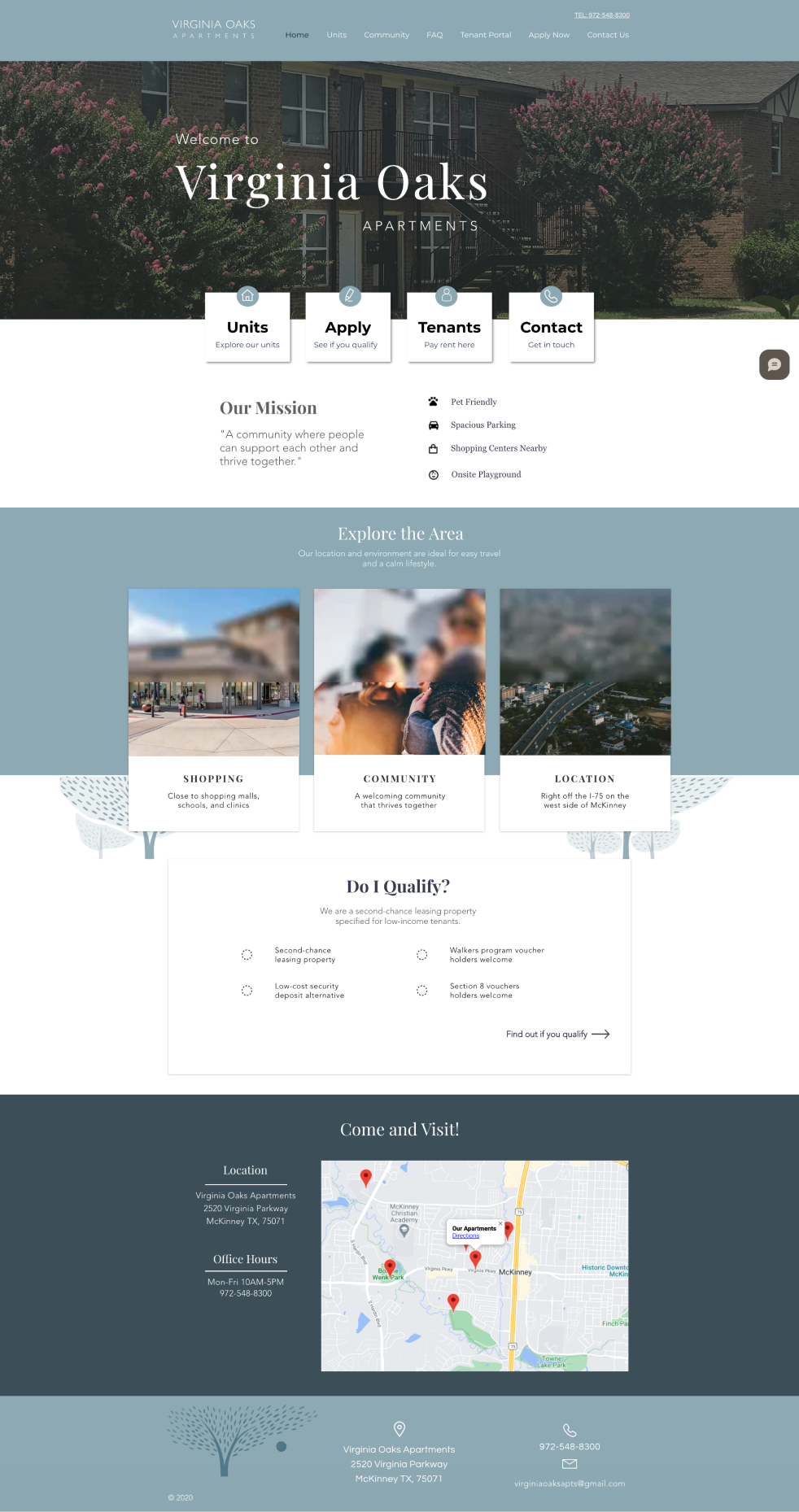
Apply Now
FAQ
Units
Unfortunately, due to pressure from the client to get the website live, we were unable to conduct a round of unmoderated or live usability tests with the target audience. Instead, the club's mentor Robert Perez provided a set of fresh eyes to help us complete another heuristic analysis of the new site.
Results
Virginia Oaks was a resounding success!
The website saw an increase in unique site visitors by 175% and the overall visits by 66%. This was after implementation in the following four weeks.
Over the next two months, Dan saw a 453% increase in unique visitors and a 142% increase in overall visits!
Reflection
I had a rewarding first experience with UX design, and these were my key takeaways.
Remote group work requires a slightly different set of skills than in-person.
In the midst of the pandemic, our cohort did not meet in person at all. This was my first experience working with a team remotely on such an in-depth project. Since we could not work alongside one another physically, I learned the importance of clear-cut responsibilities, deadlines, and check-ins, which helped me adapt my first remote career job at a start-up. I also gained collaborative experience with tools like Miro and Figma.
Sometimes businesses goals and user needs are not aligned, and that's okay.
Our interviewees all said that pricing was an important factor that they look for in a housing website, but for business reasons, Dan was firm in not wanting to include that information. We made our case, but ultimately could not fulfill this user need. I learned that this is part of the UX design process; design should be user-centered, but the end product must also factor in the client's business needs that the user does not see. We are advocates for the user, but we cannot feasibly give them everything they ask for. It's all about prioritization.
More case studies
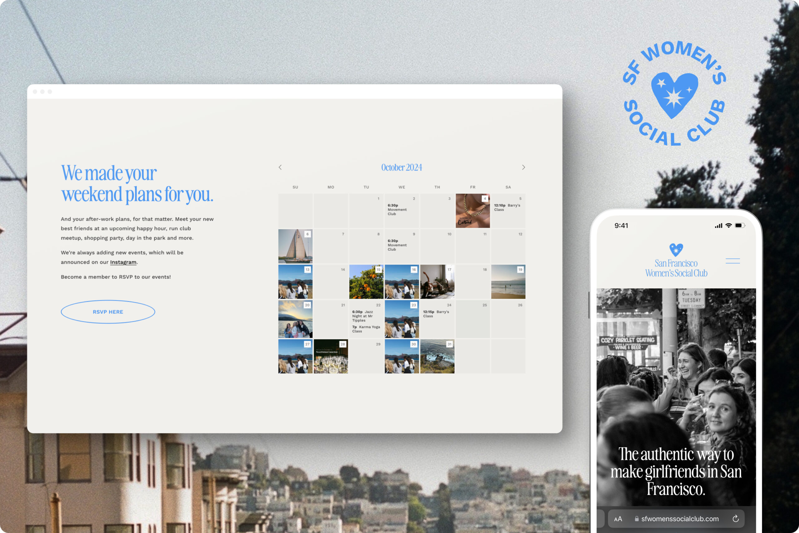
SF Women's Social ClubBrand Identity & Website
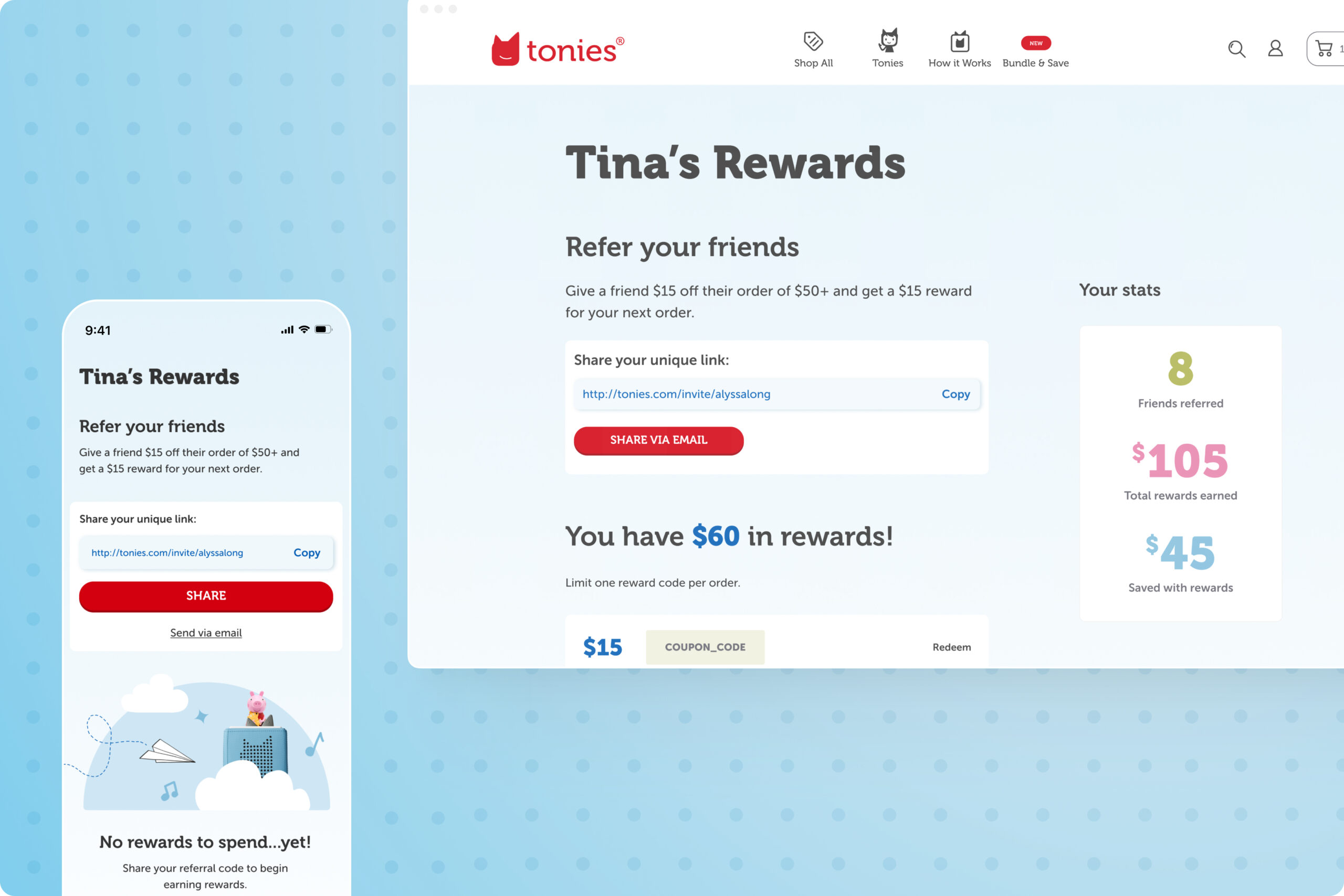
toniesUX Design

GovernClient Project
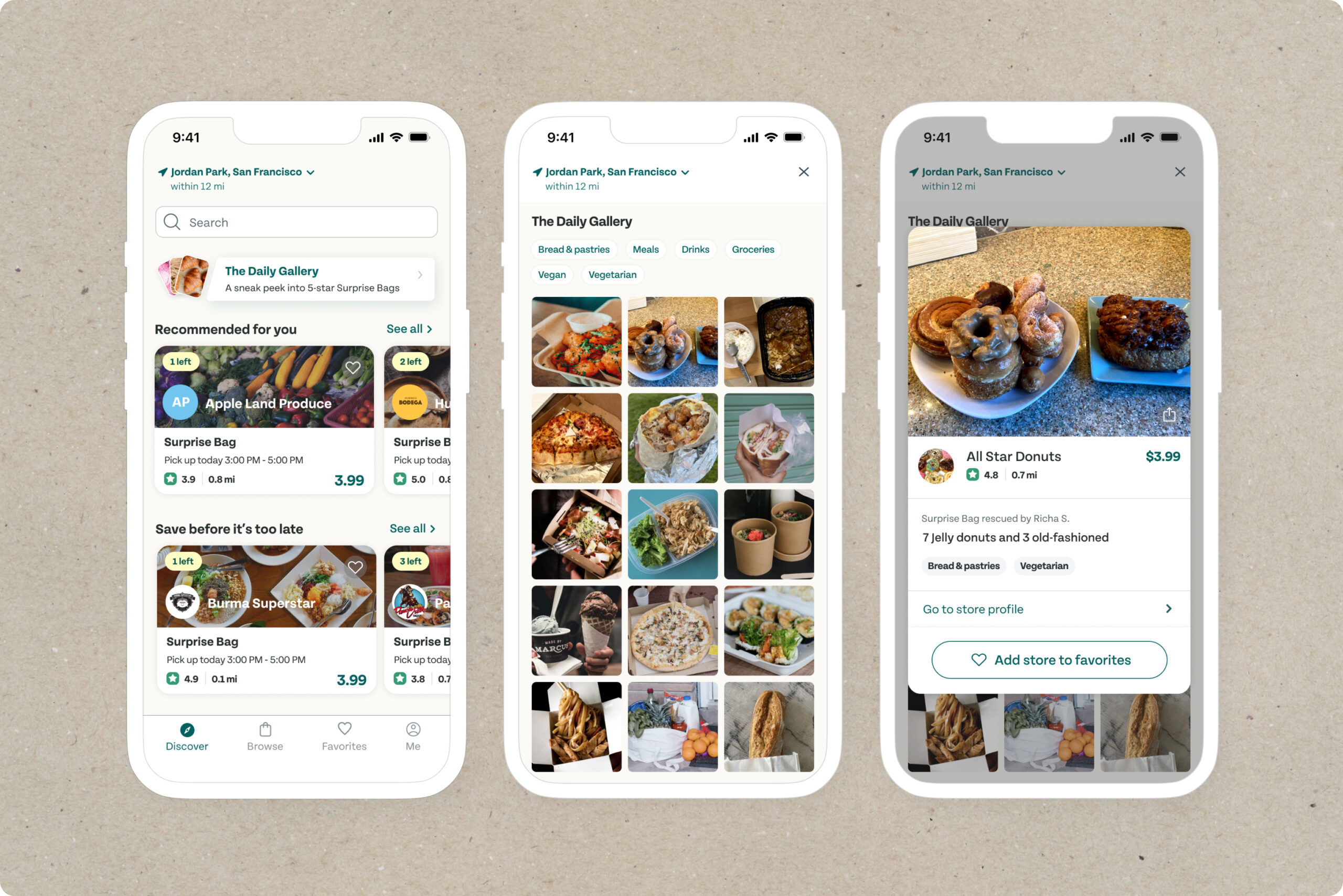
Too Good to GoProof of Concept